
With most marquee event identities, we look to the host team, city, venue, and cultural influences to provide a connection that can support an expansive visual platform. For San Jose, we dove into the Sharks’ home town for inspiration–The Heart of Silicon Valley.


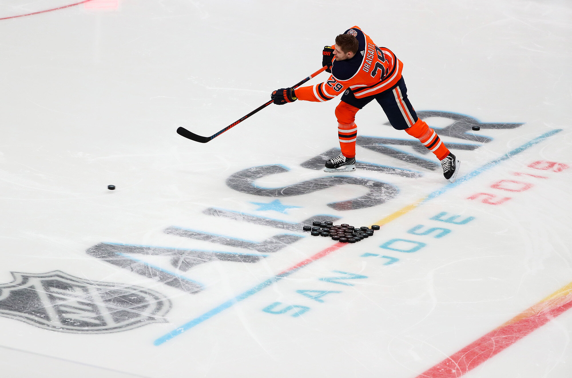


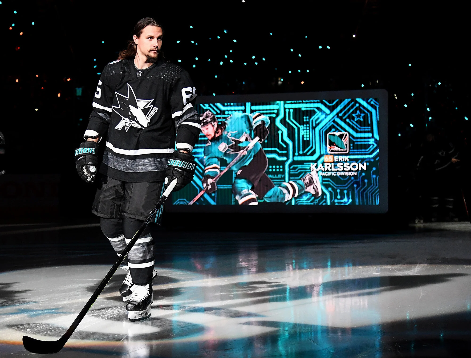


There was the Spanish influence in local architecture and there was a famous mission. They had their cultural district and SoFA (South of First Area) full of street art and the Mexican Day of the Dead Celebration with the colorful “Sugar Skull” masks. But, then there was the influence that enveloped the city above all others. San José sits at the heart of Silicon Valley. Ebay, Adobe, Cisco, Samsung and many others call San José home. That was the meaningful connection we wanted to leverage.
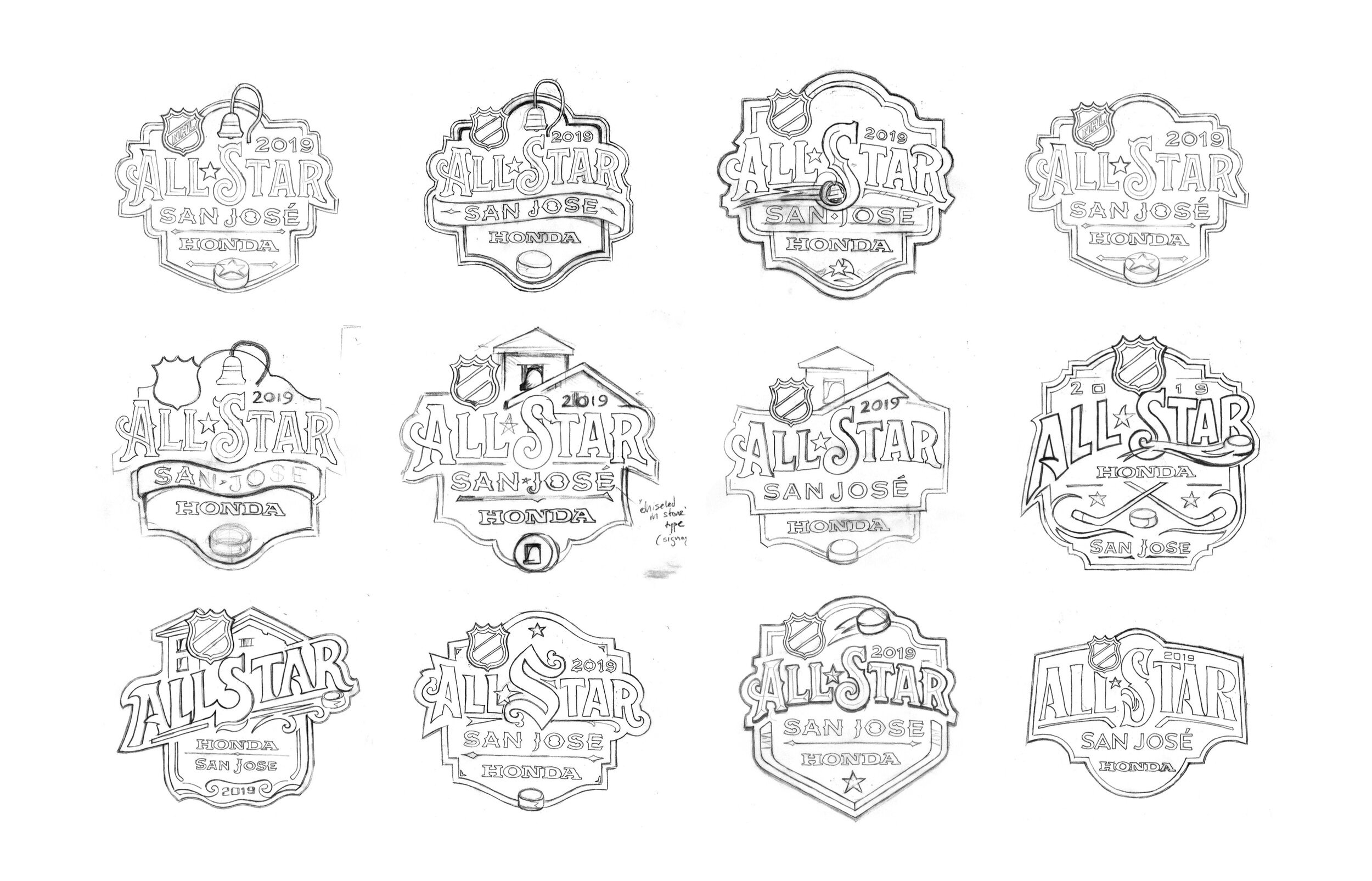
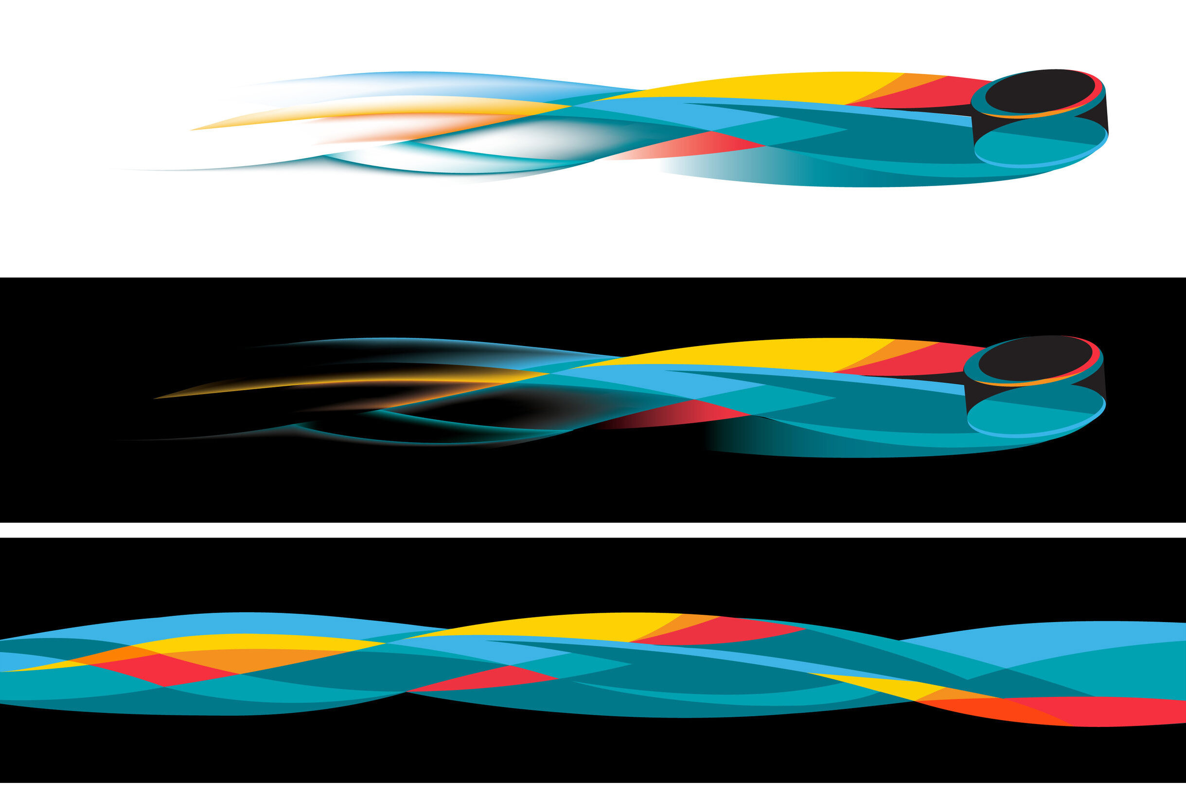
Capturing current 2018/2019 tech was crucial or we would run the risk of local Sharks fans–who live and breath tech–seeing the mark as an outdated, cliche impression of tech from out-of-towners. So, no circuit boards (for now). But, an app might be just the inspiration we wanted. The aesthetic of current day tech is clean and simple. It uses pure, vibrant colors that feel transparent. Typography is typically unadorned and undecorated sans serif. And then there is the negative space. These visual sensibilities were initiated years ago by Apple who prioritized design as a way to express the approachability and ease of use of their lifestyle tools–contrasting themselves from competitors who sold clunky machines called “computers.”
The result is a refreshing approach to All-Star that combines Silicon Valley sensibilities and using the compositional influence of an app icon. The notifications bubble that holds the year is the cherry on top.


Client-side Creative Direction : Paul Conway, NHL VP Creative +++ Environmental Graphics : Infinite Scale
On-site Photography : Getty Images


