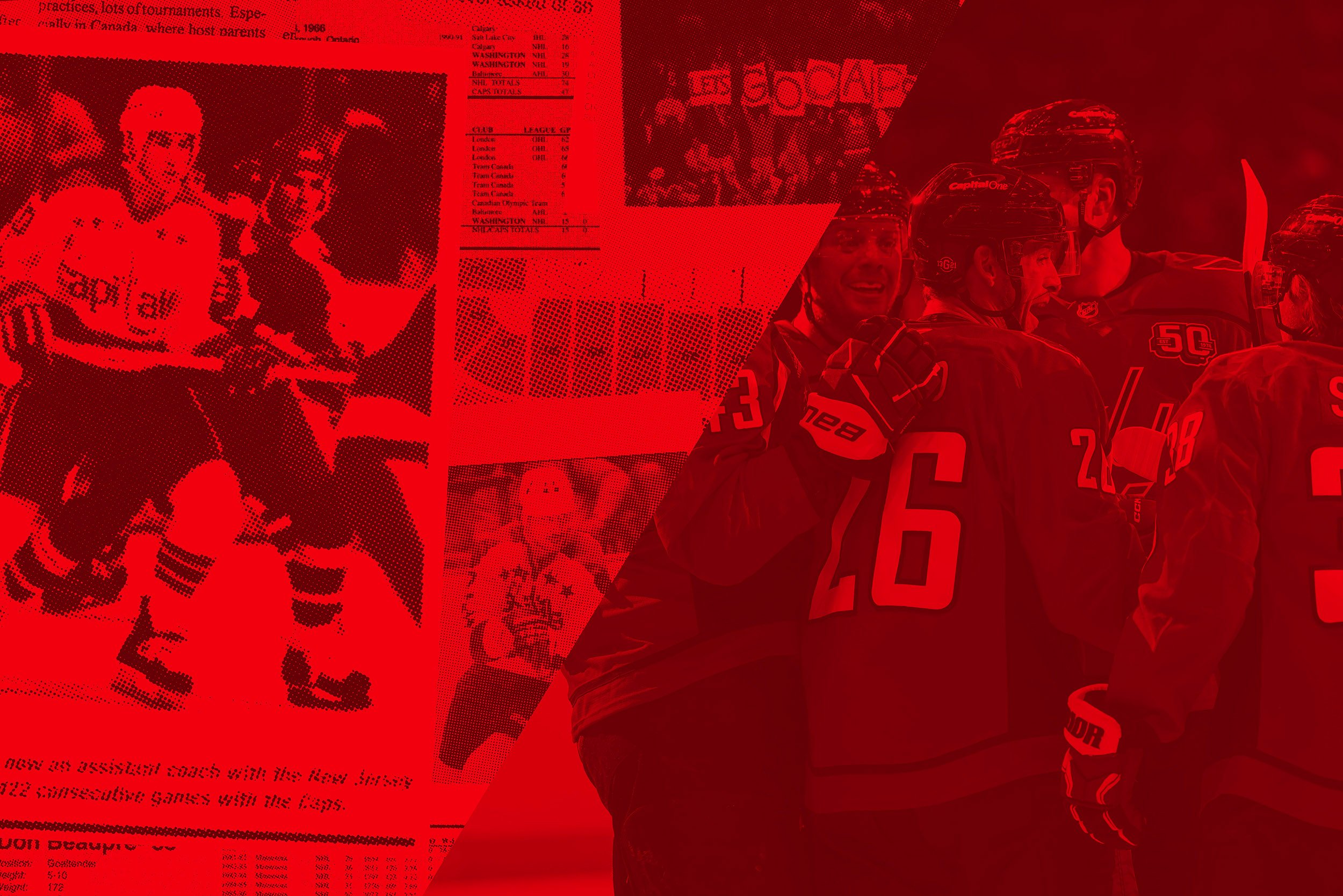
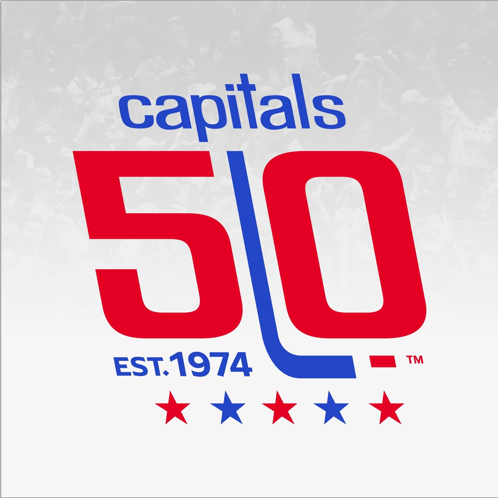
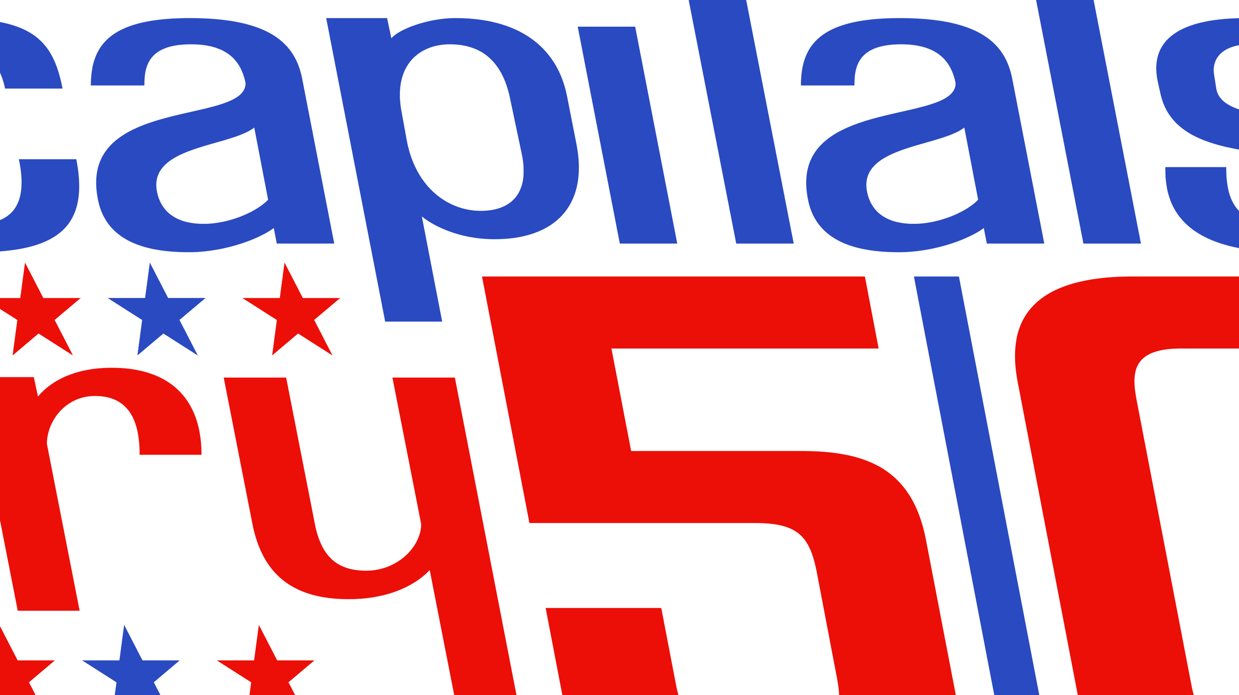
An homage to the beginnings of the Washington Capitals franchise; an anniversary mark fifty years in the making that celebrates the team and its roots by utilizing their unique reverse-italic lettering and capturing the unmistakable style of the original 1974 Capitals logo.
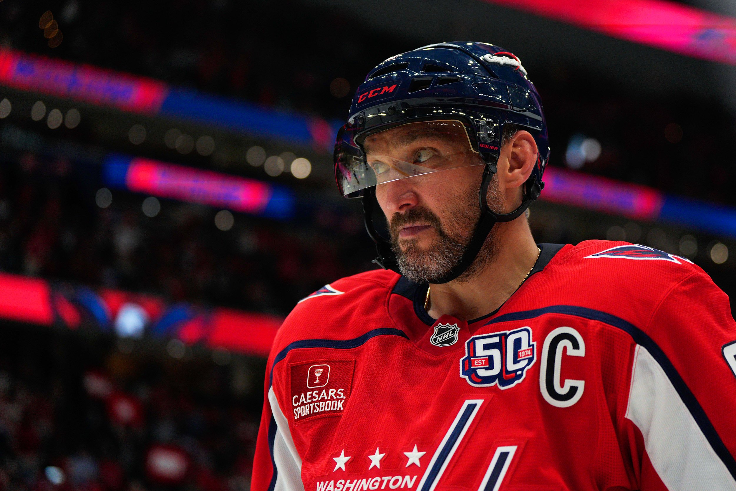
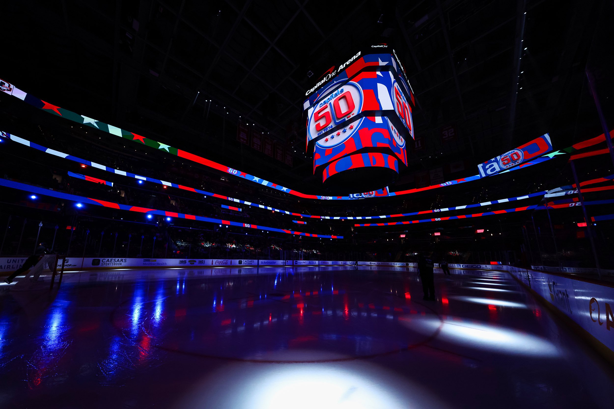
Anniversary Logo
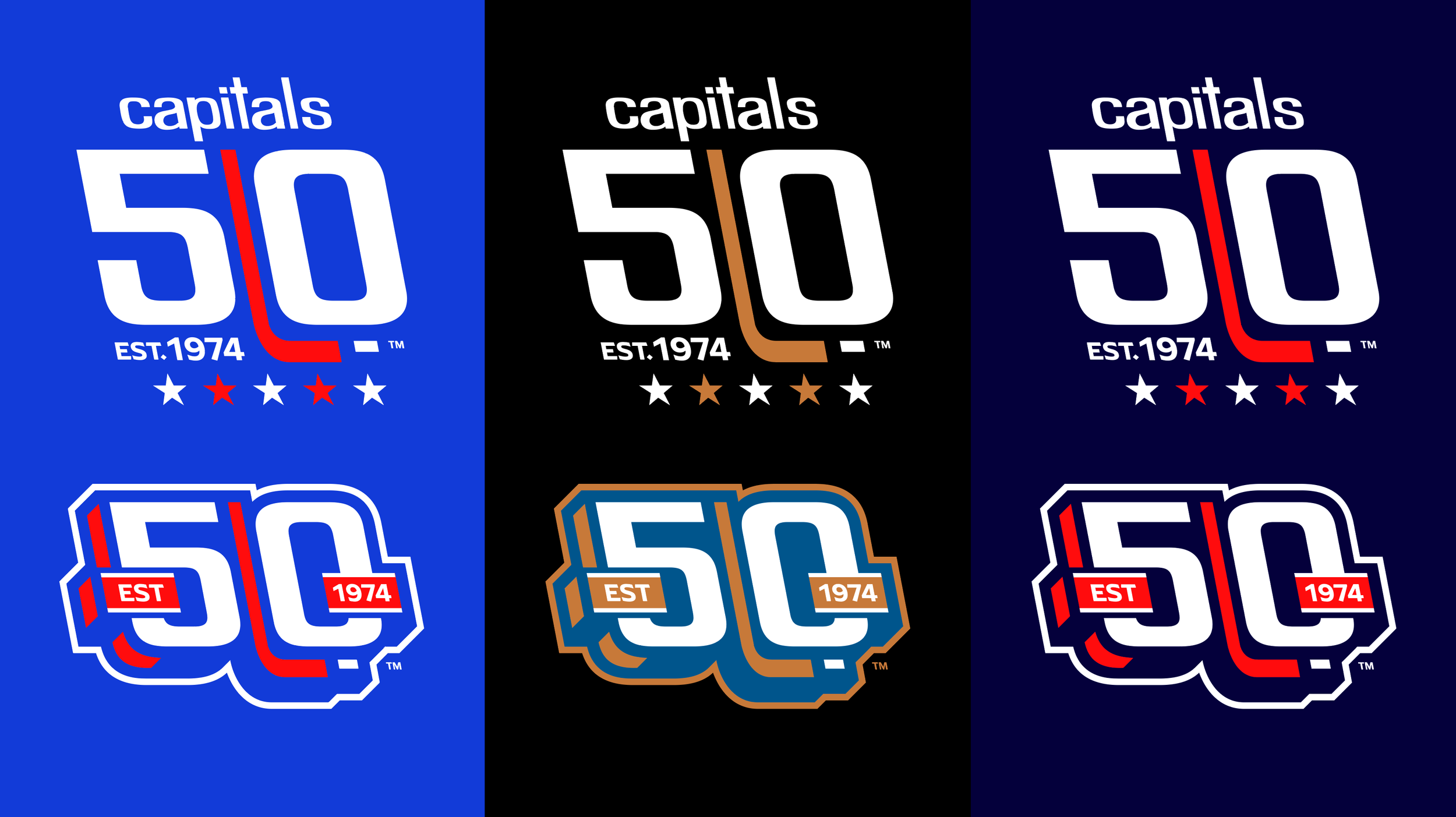
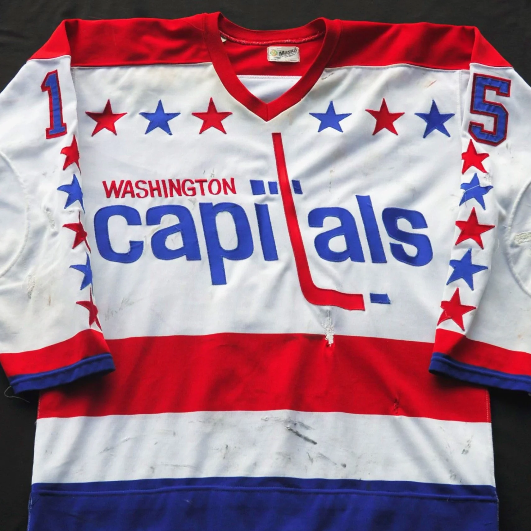
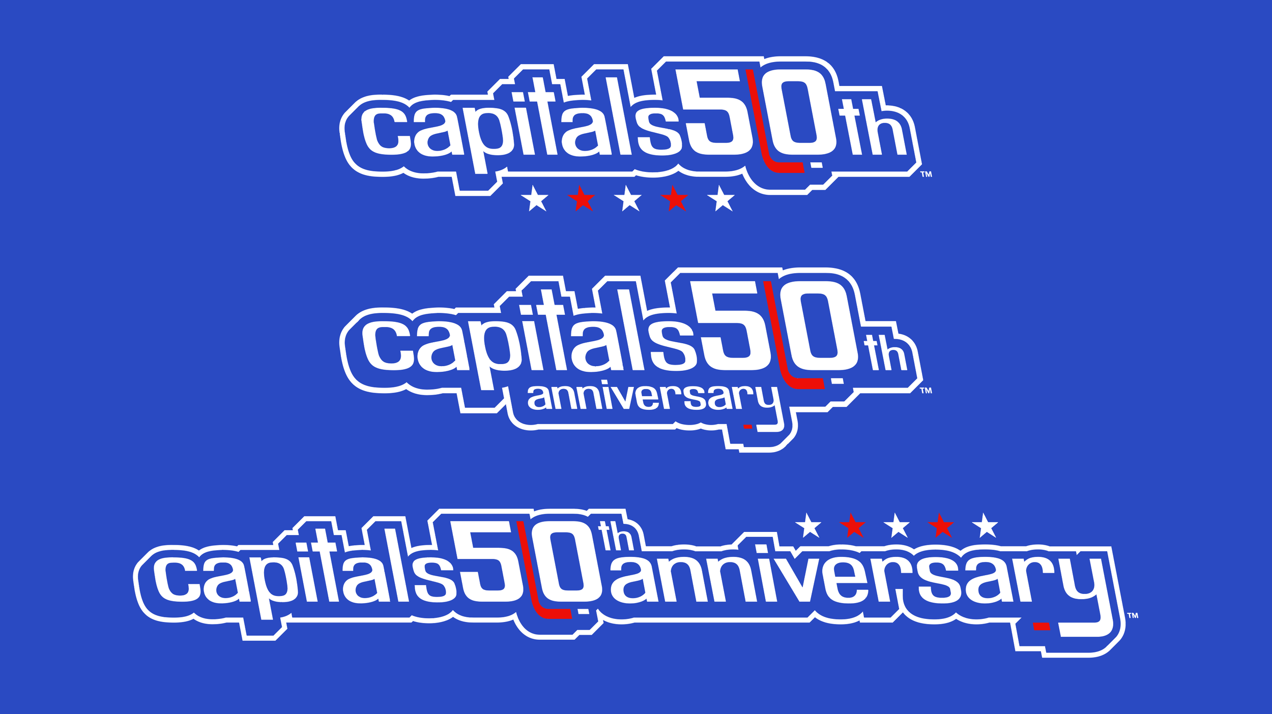
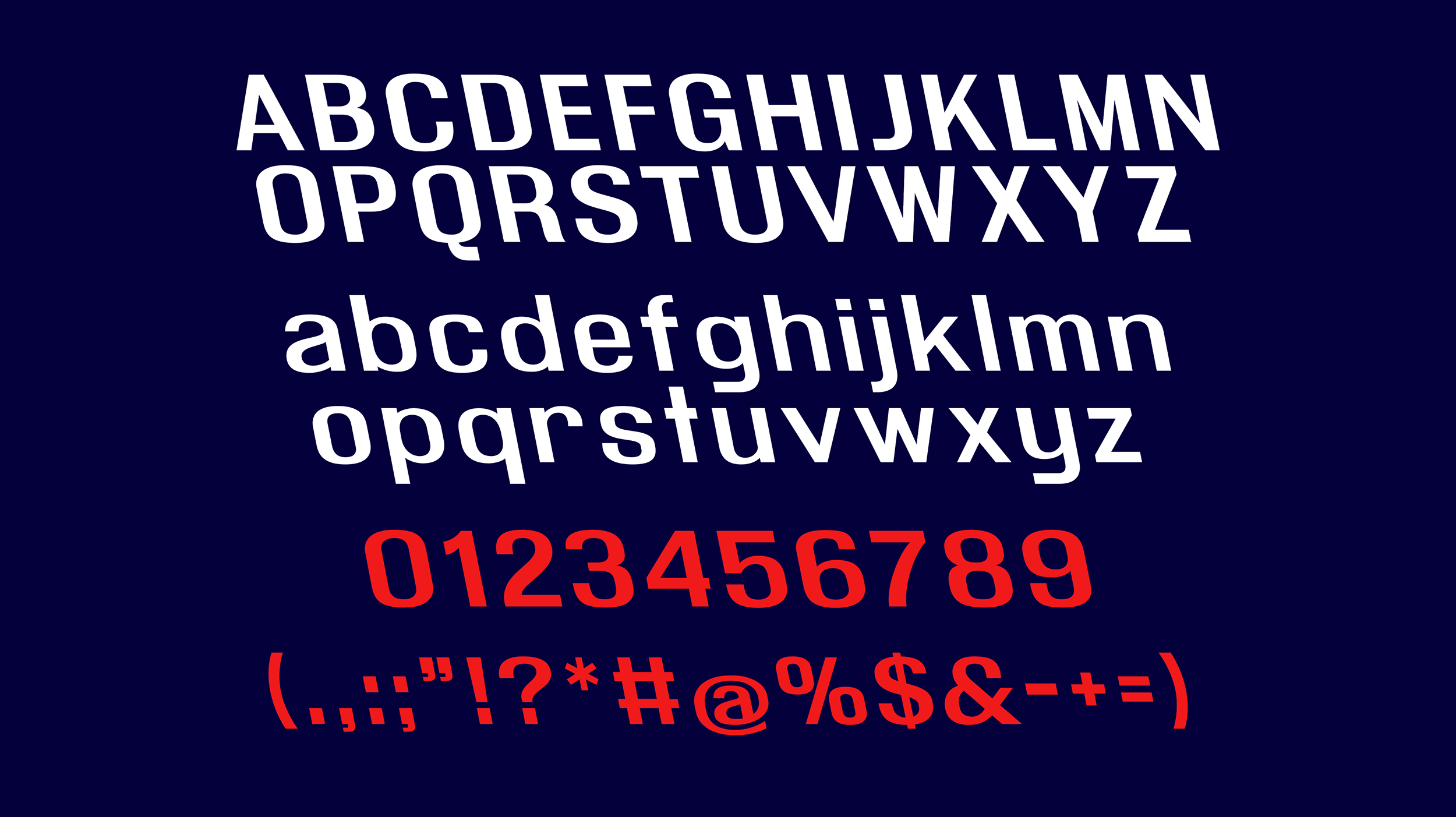
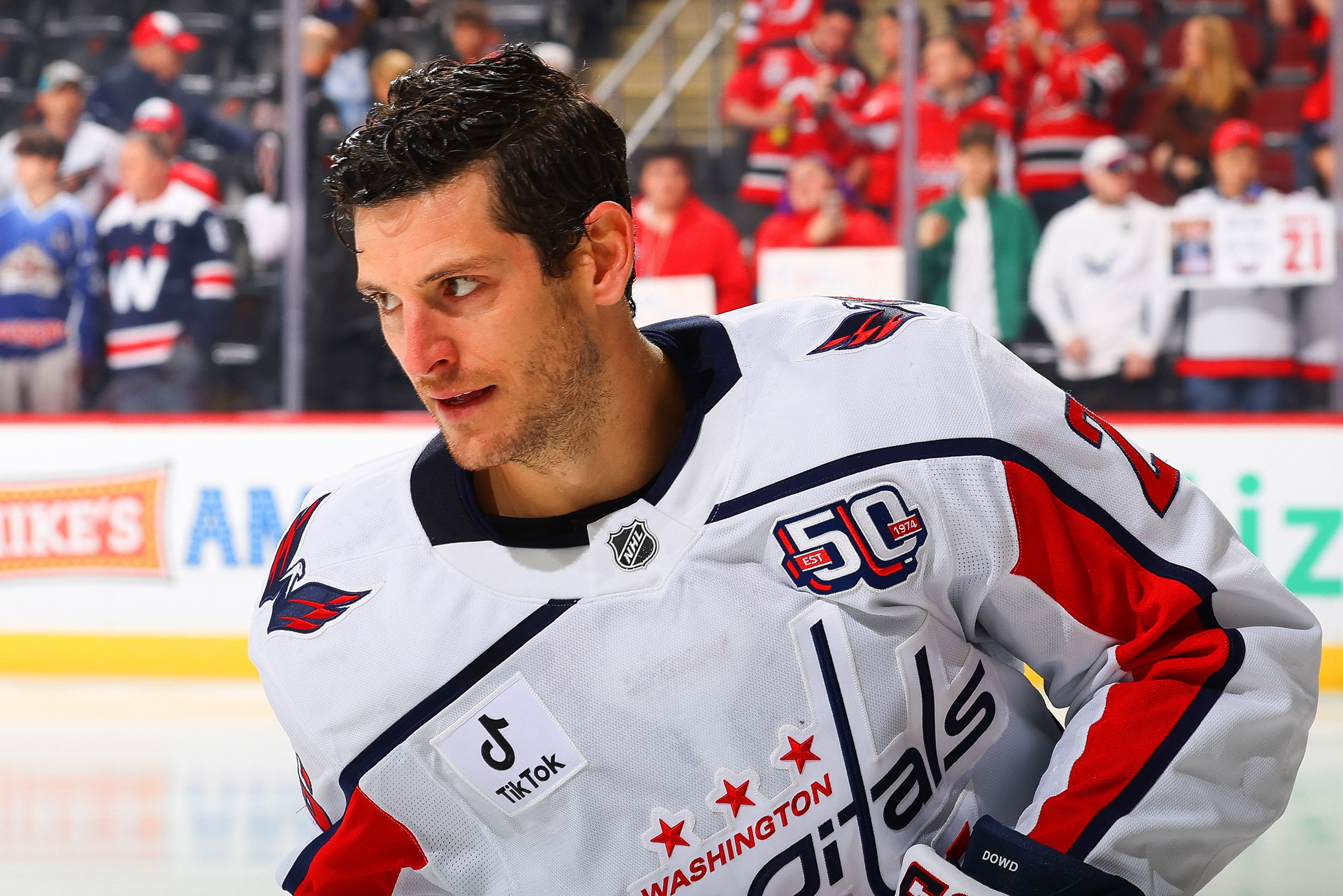
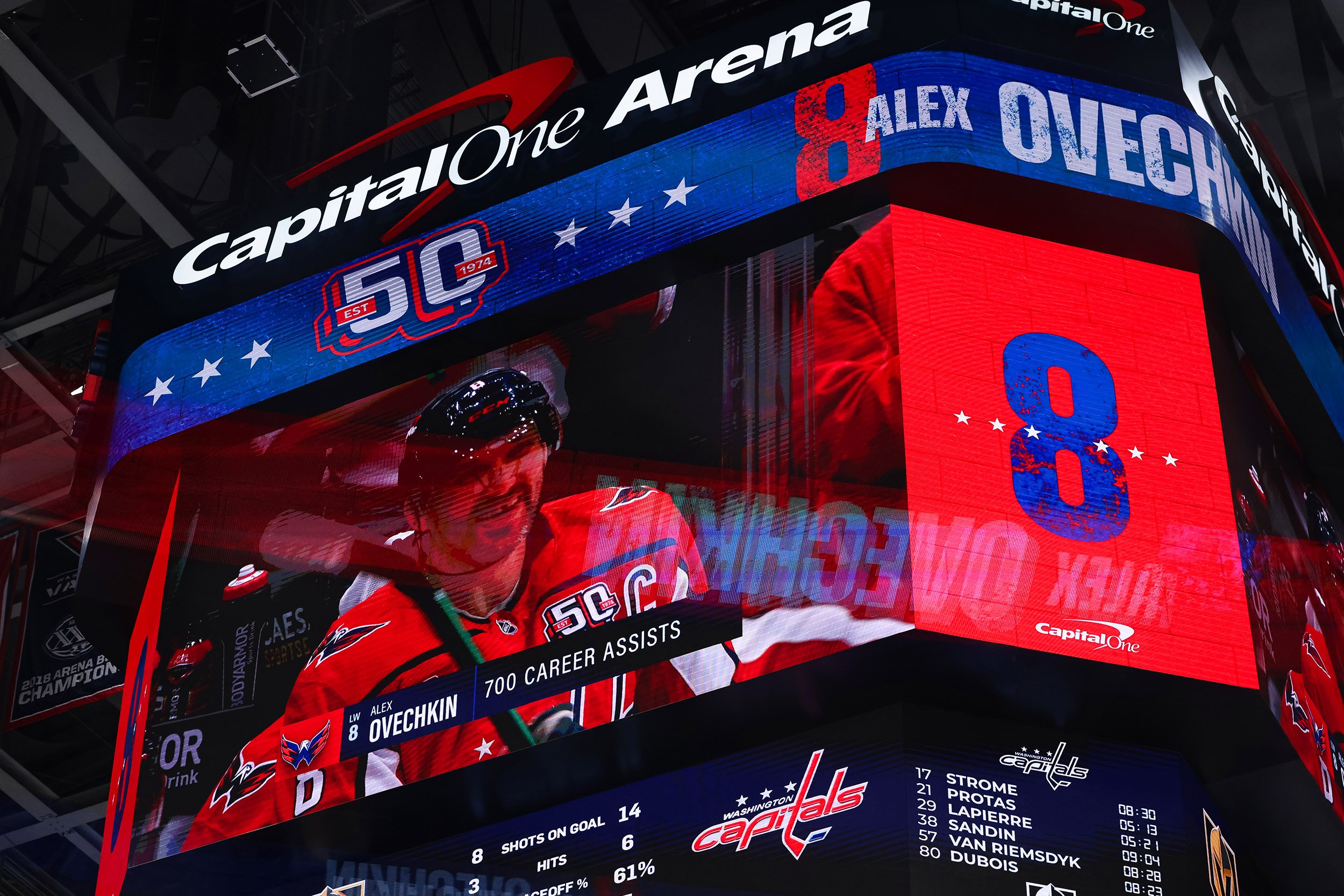
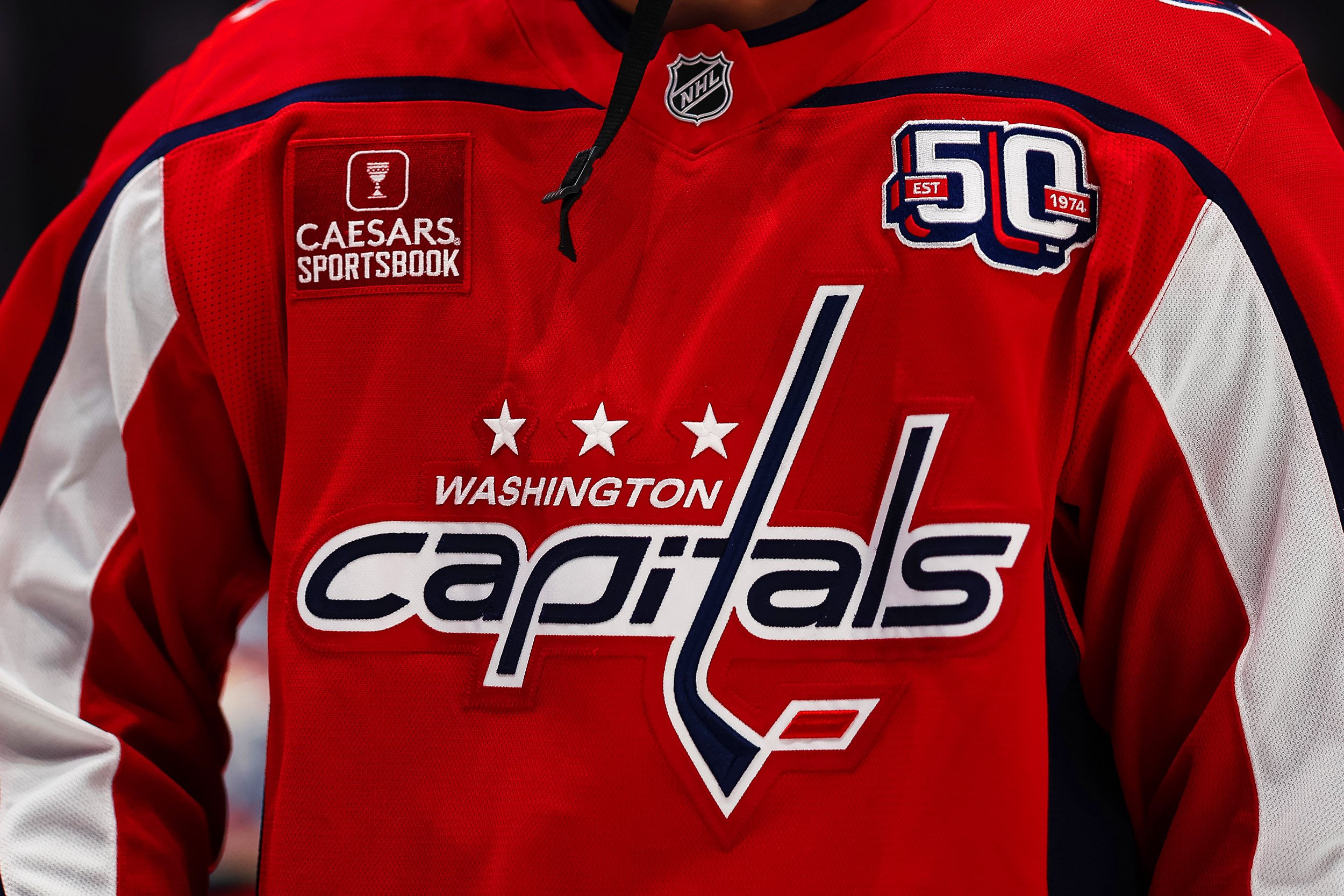
The Capitals 50th Anniversary logo was designed to be unmistakably Washington Capitals. We first looked at their original 1974 reverse-italic uniform lettering as a primary source of inspiration and created a “50” that honors this style. We then reverse-engineered their logo and created a full typeface of reverse-italic characters, including uppercase, lowercase, numbers, and special characters. To honor their roots, we added a few iconic elements of the 70s Capitals brand into the logo: the graphic hockey stick and stars colored in the Capitals’ original vibrant blue and red. These small but deliberate details come together to form a 50th Anniversary mark that honors the full history of the Washington Capitals.
To celebrate the three distinct visual eras of the Capitals, we designed every program element in three unique color palettes: “Caps Classic” Red and Blue, “90s Era” Blue, Gold, and Black, and “Modern Era” Red and Navy.



Anniversary Campaign
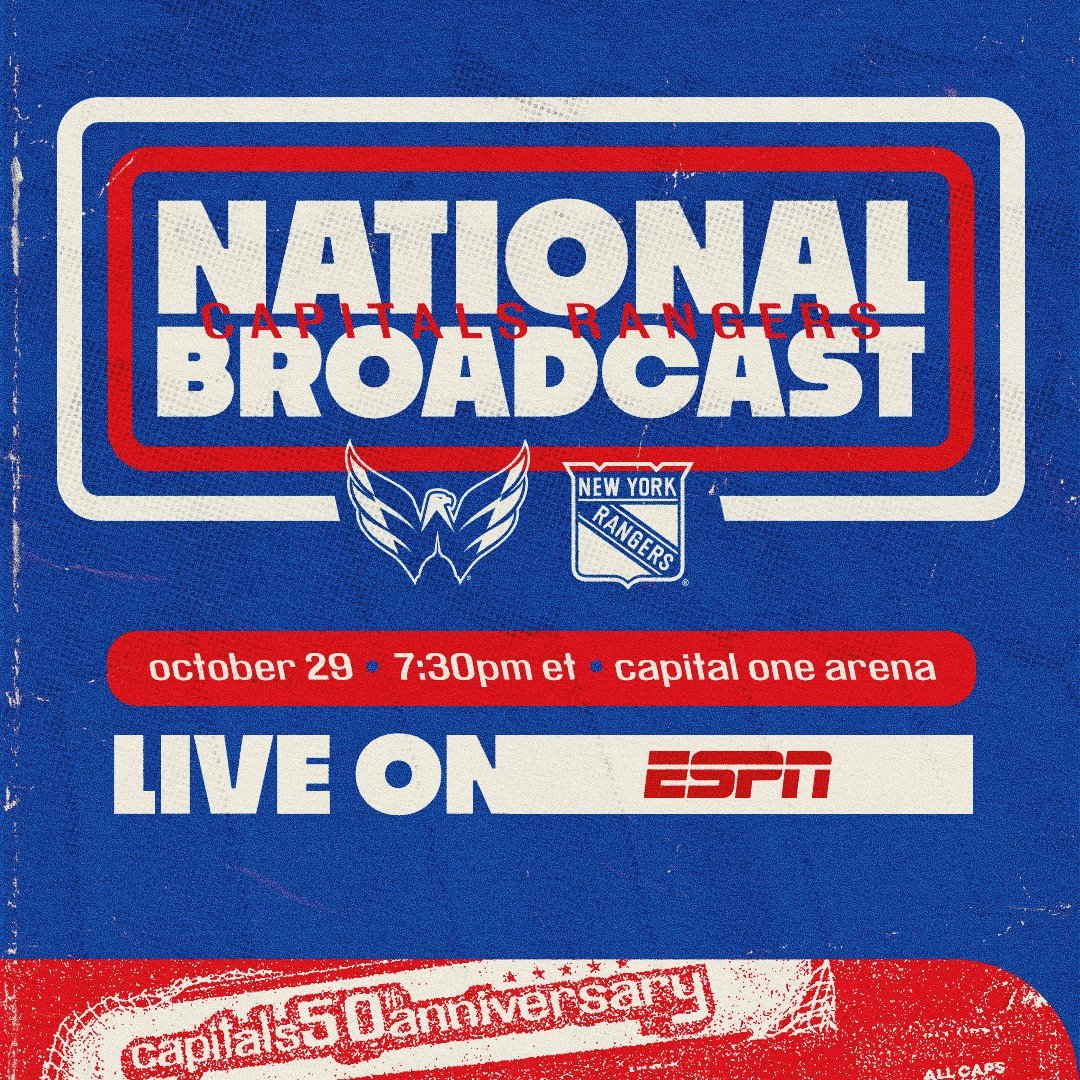
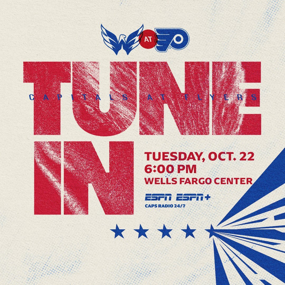
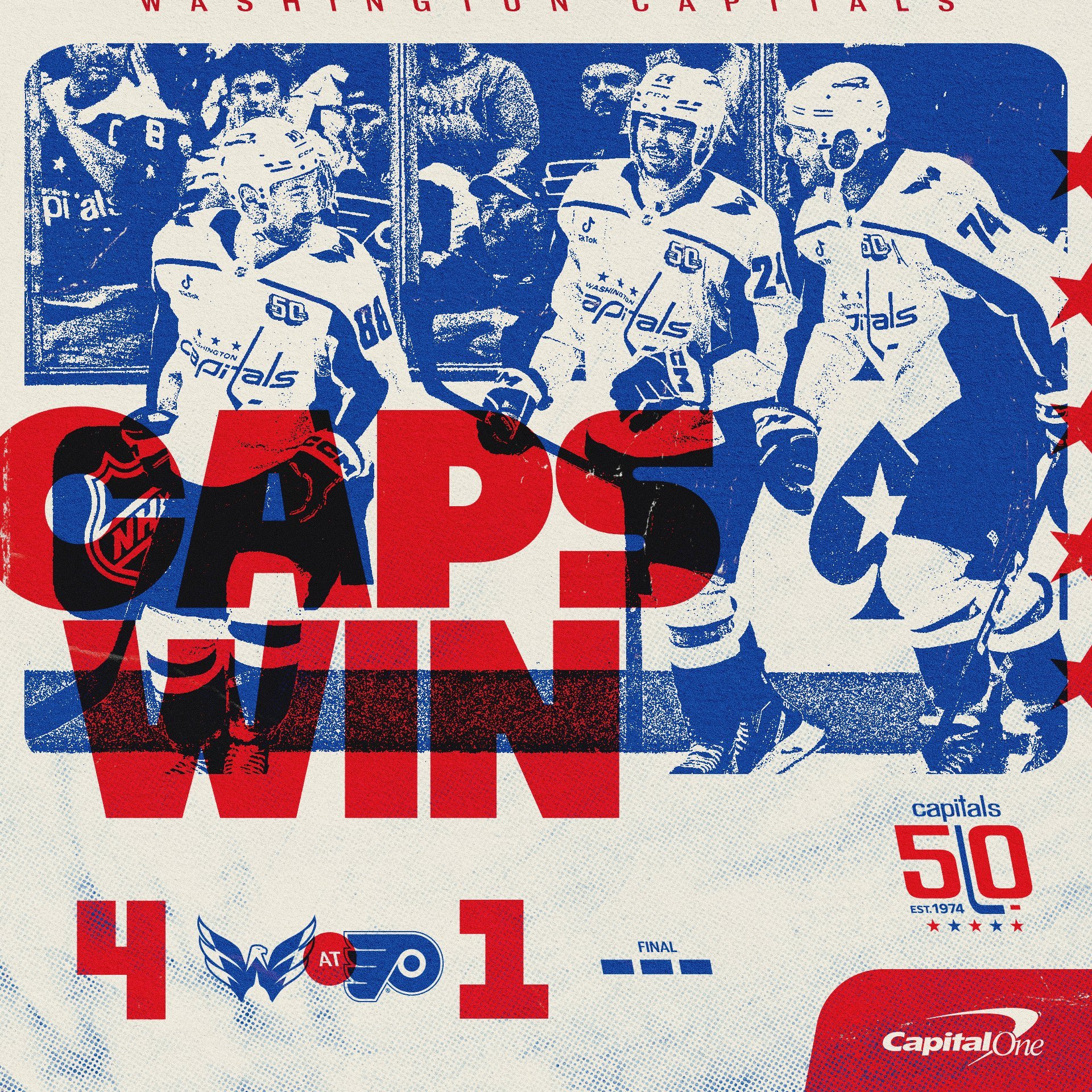
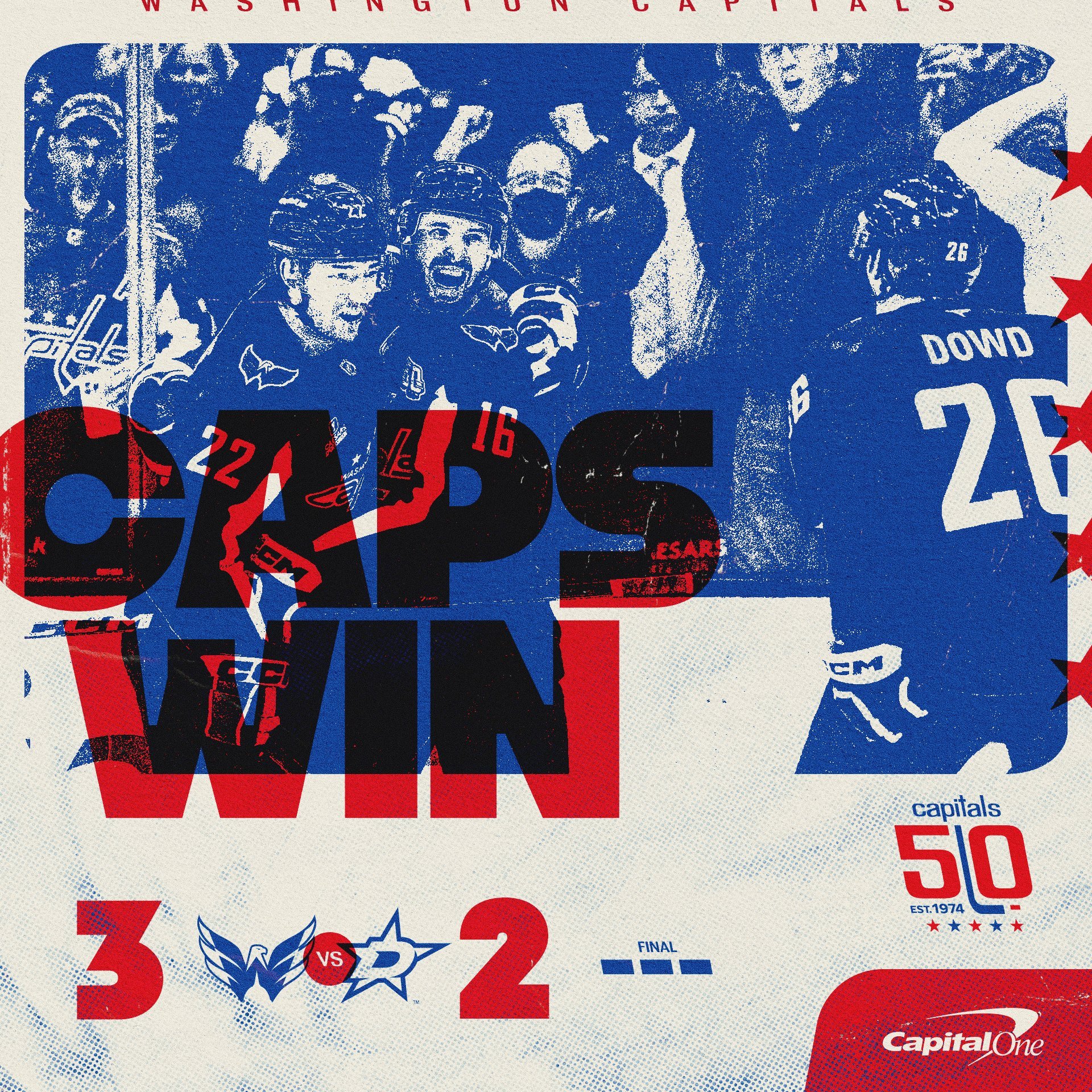
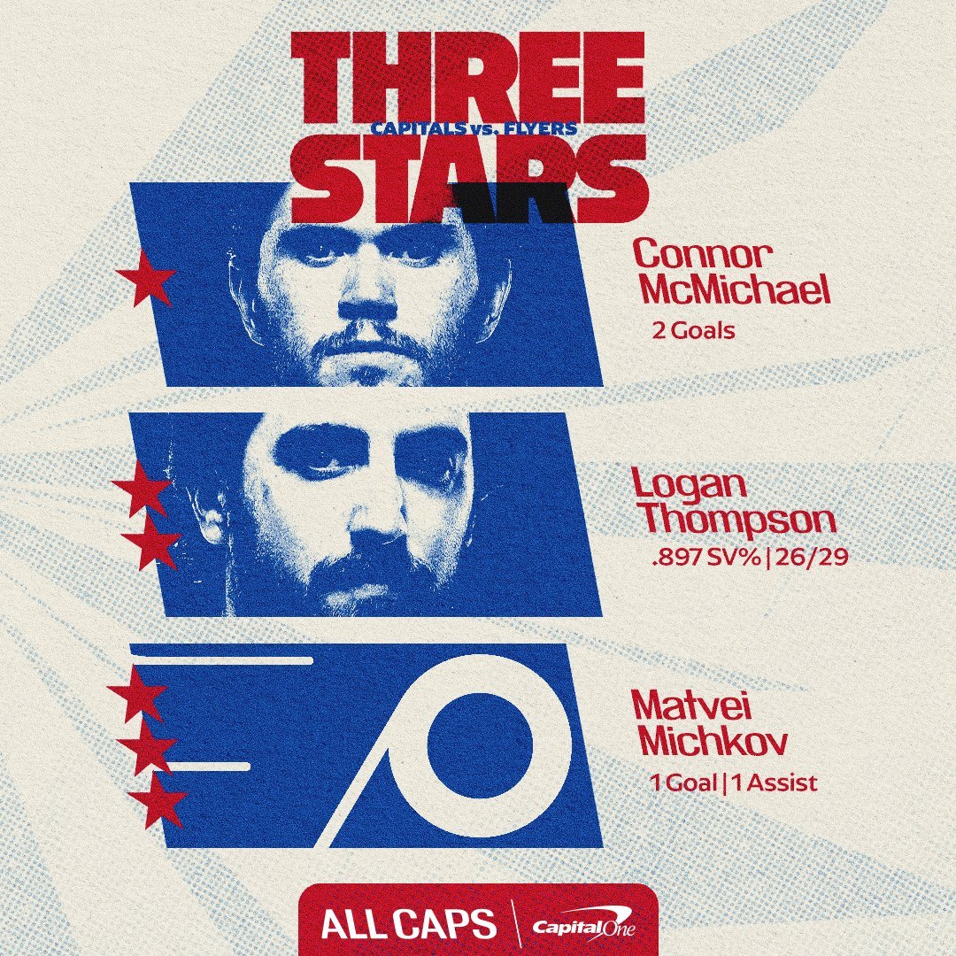
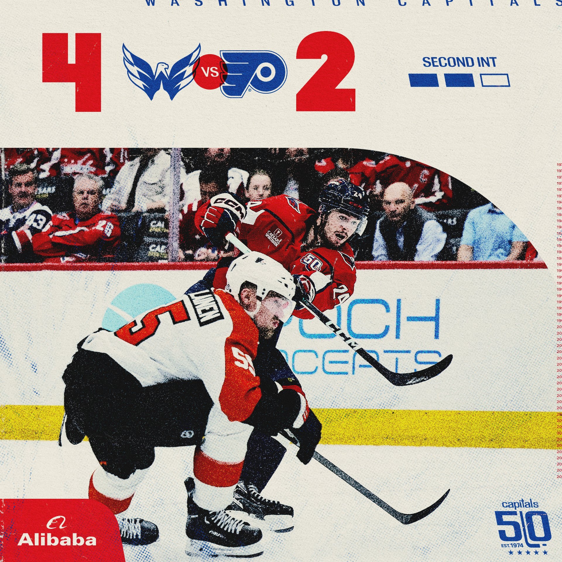
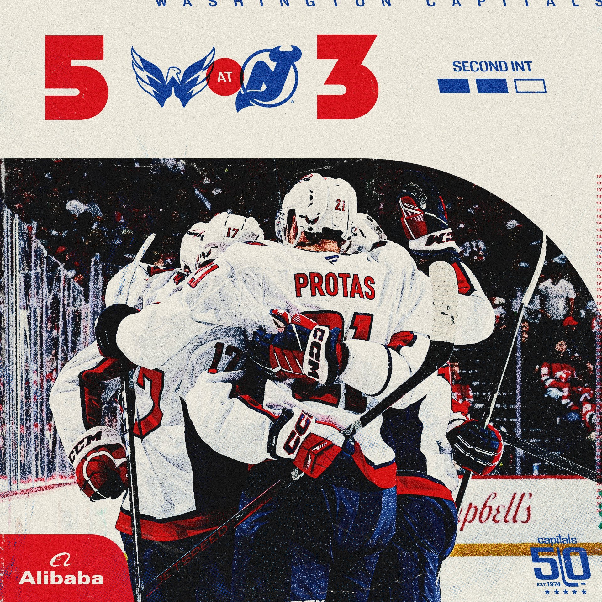
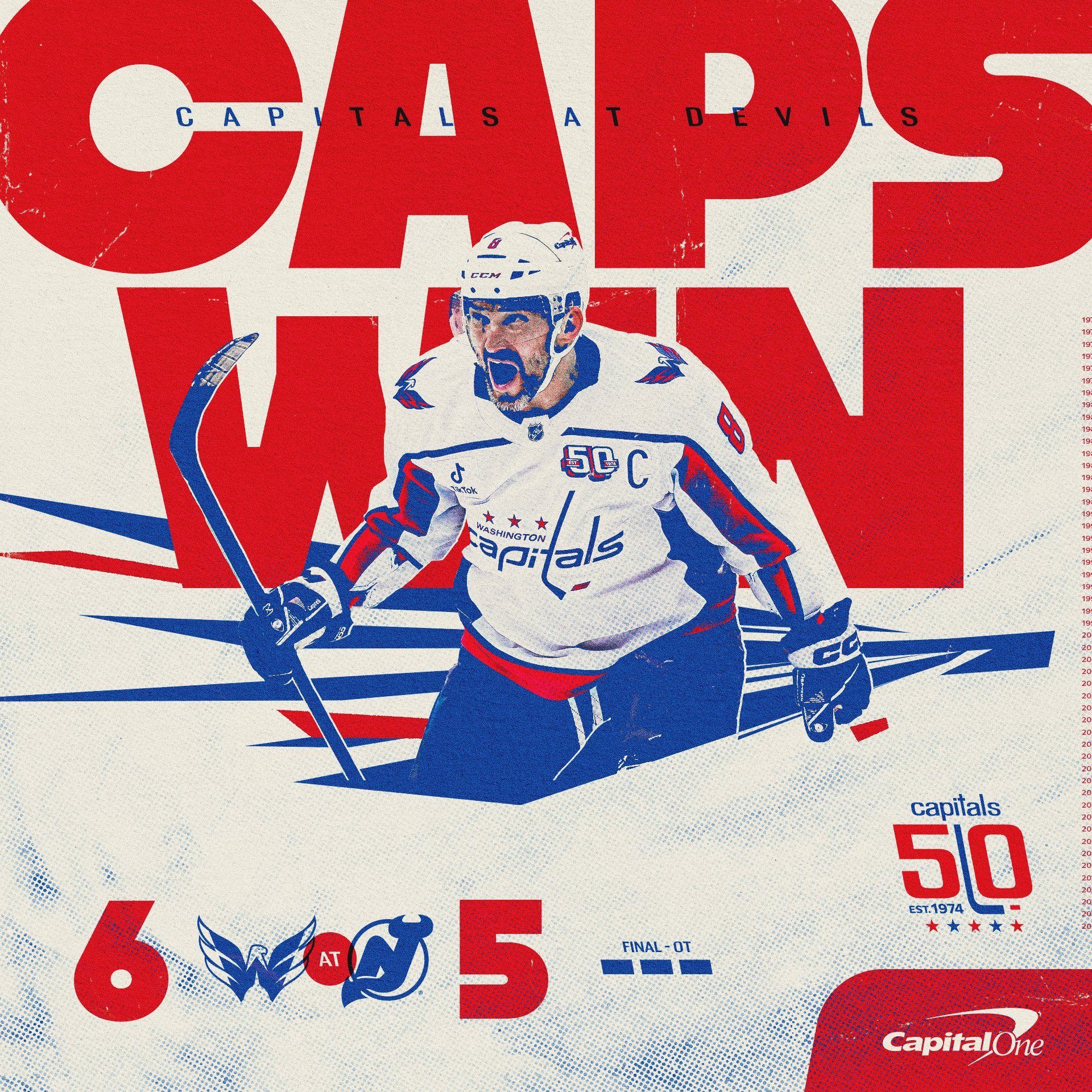
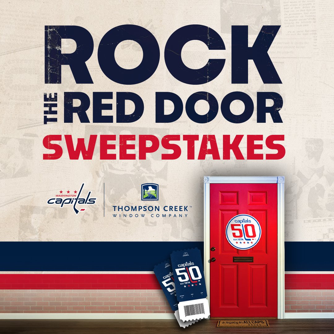
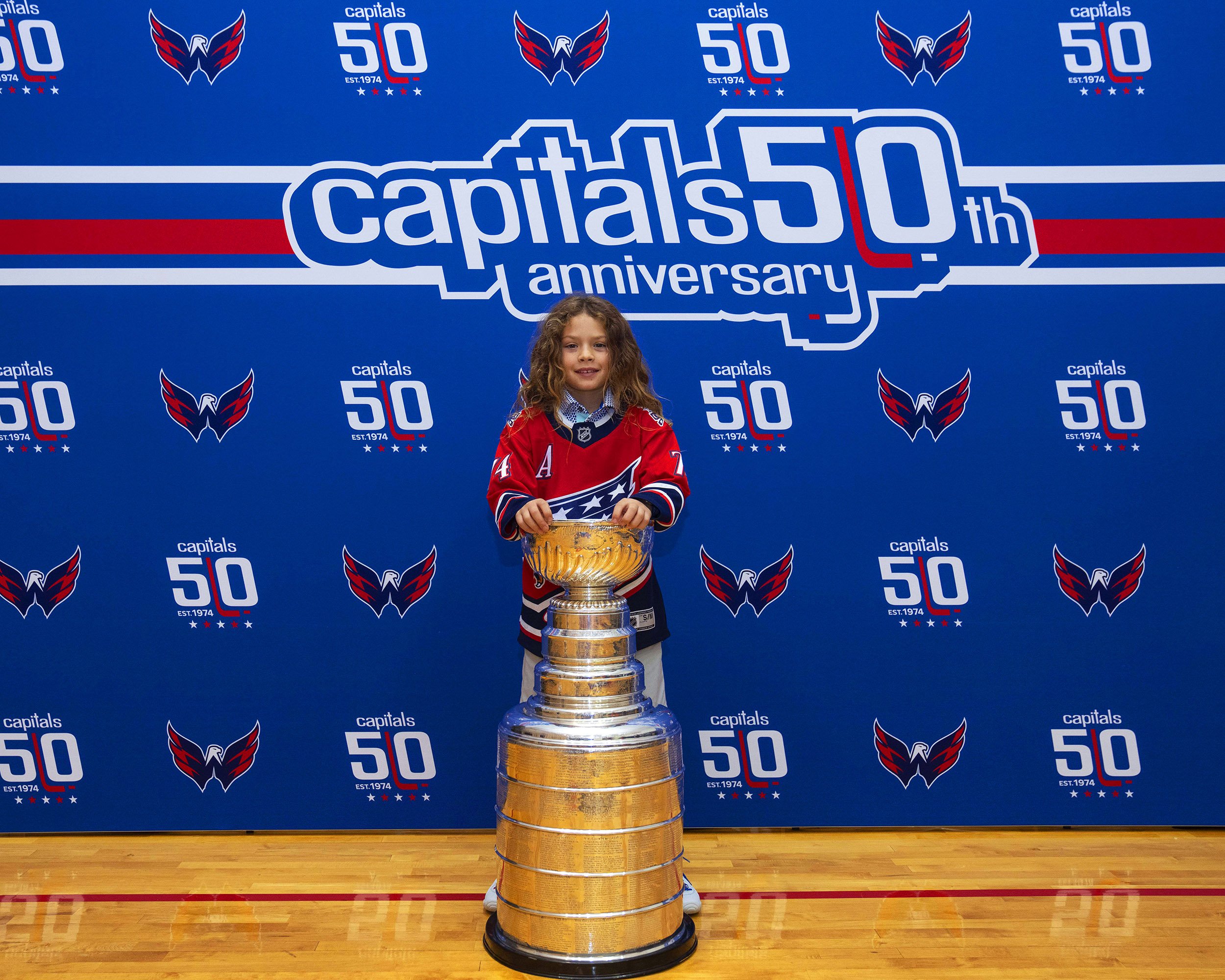
In addition to the 50th Anniversary identity package, we also designed the elements and guidelines for the 2024-25 season Anniversary campaign, which was then brought to life by the Capitals’ incredible in-house design team.
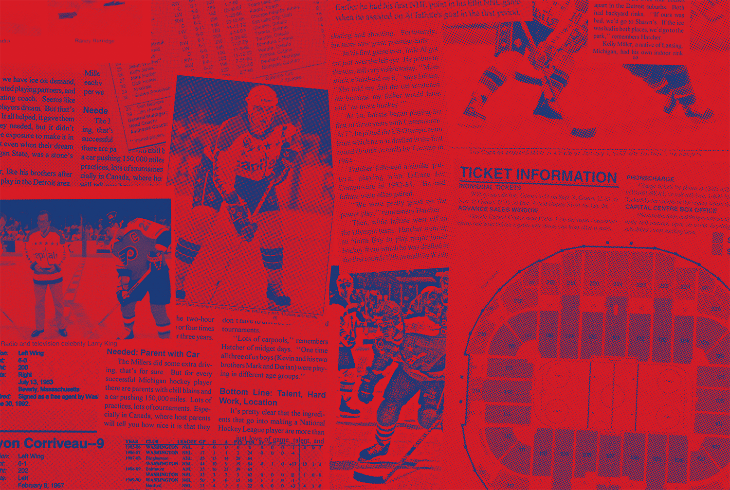
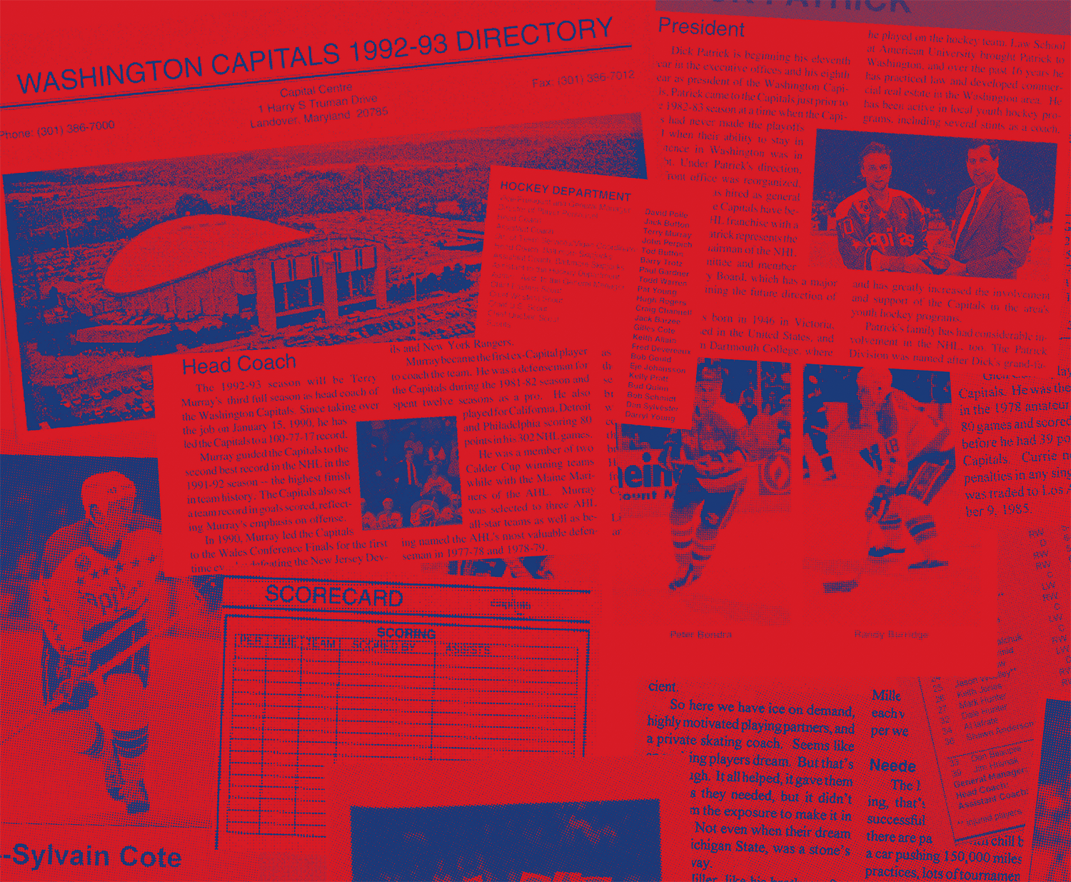
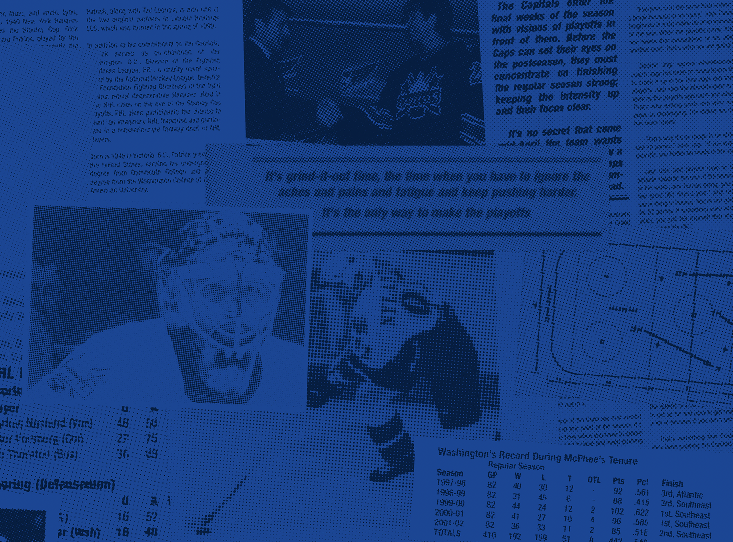
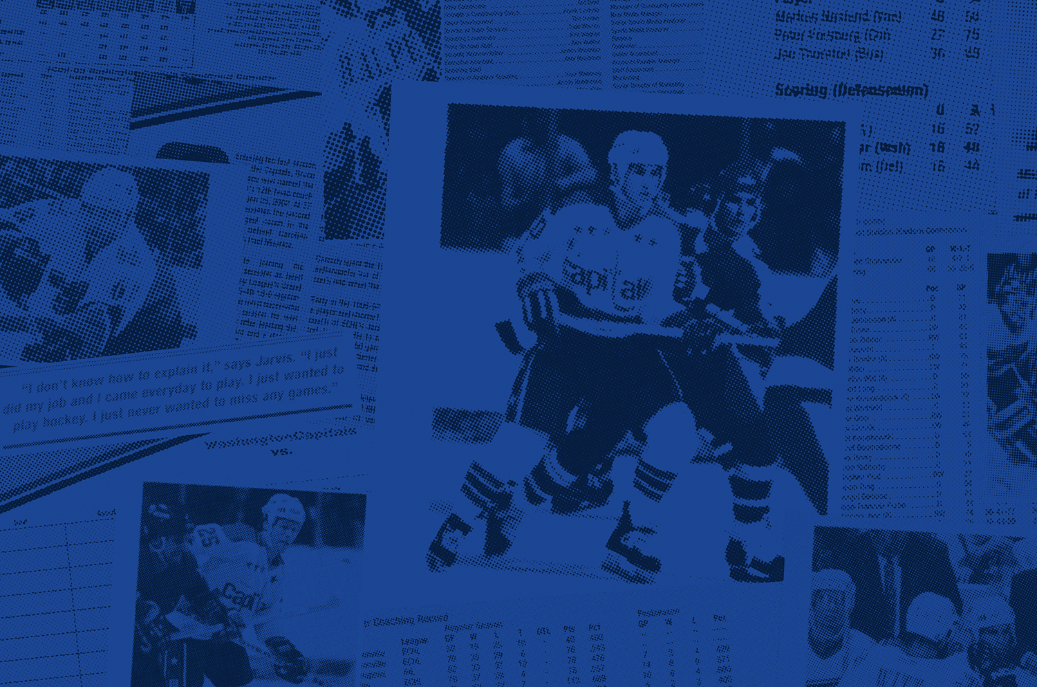
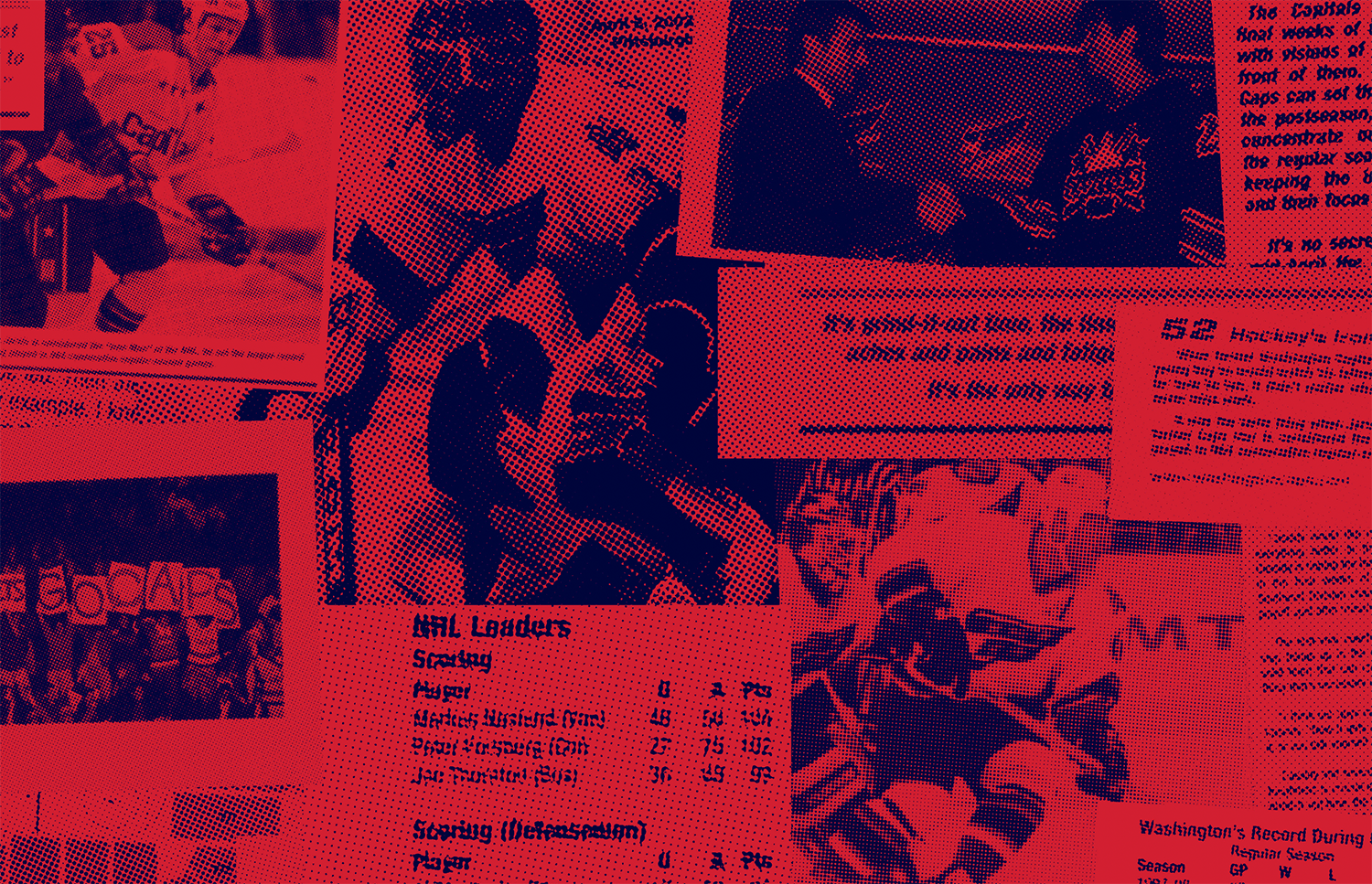
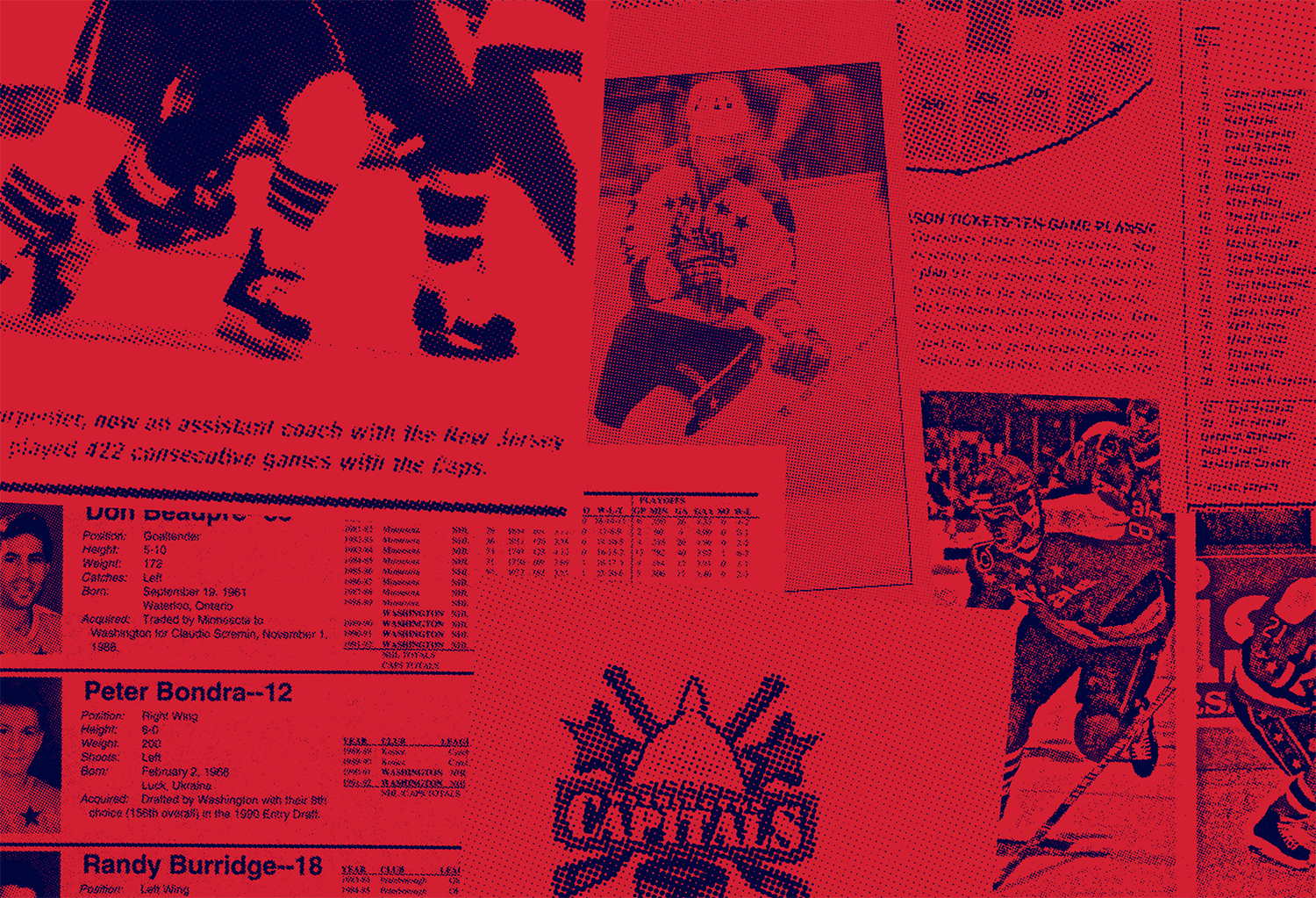
The Capitals 50th Anniversary Campaign borrows thematic elements from the distinctive design style that emerged in 1970s which was widely used during the Capitals inaugural season in 1974. The primary brand element, graphic striping, was inspired by early Capitals sock and jersey striping, with the geometric curves inspired by posters and trading cards of the period. Additional visual elements like halftone photography, newsprint textures, and stars were used to engrain the narrative of the logo throughout the full seasonal campaign and represent the blending of the Capitals past with the team’s present.
This combination of logos and elements honors the era when the Capitals legacy was born.
Client-side Creative Direction: Frank O’Brian, Amanda Tischler +++ Seasonal Campaign elements: Second Melody +++ Reverse-italic typeface: CJ Zilligen
Design Collaboration: Todd Radom +++ Seasonal campaign imagery from Capitals social media accounts


