WHO WE ARE:
Fanbrandz is a sports branding creative agency that partners with leagues, teams, and individual athletes to strengthen their connections with fans.
Whether it’s a new team logo, brand guidelines, or a visual identity for a major sporting event, our sports branding creative agency exists to capture the spirit of a brand and share it with fans all over the world.


Celebrating One-Hundred Years of Bruins.

A new brand identity for the KBO
baseball team, the SSG Landers.
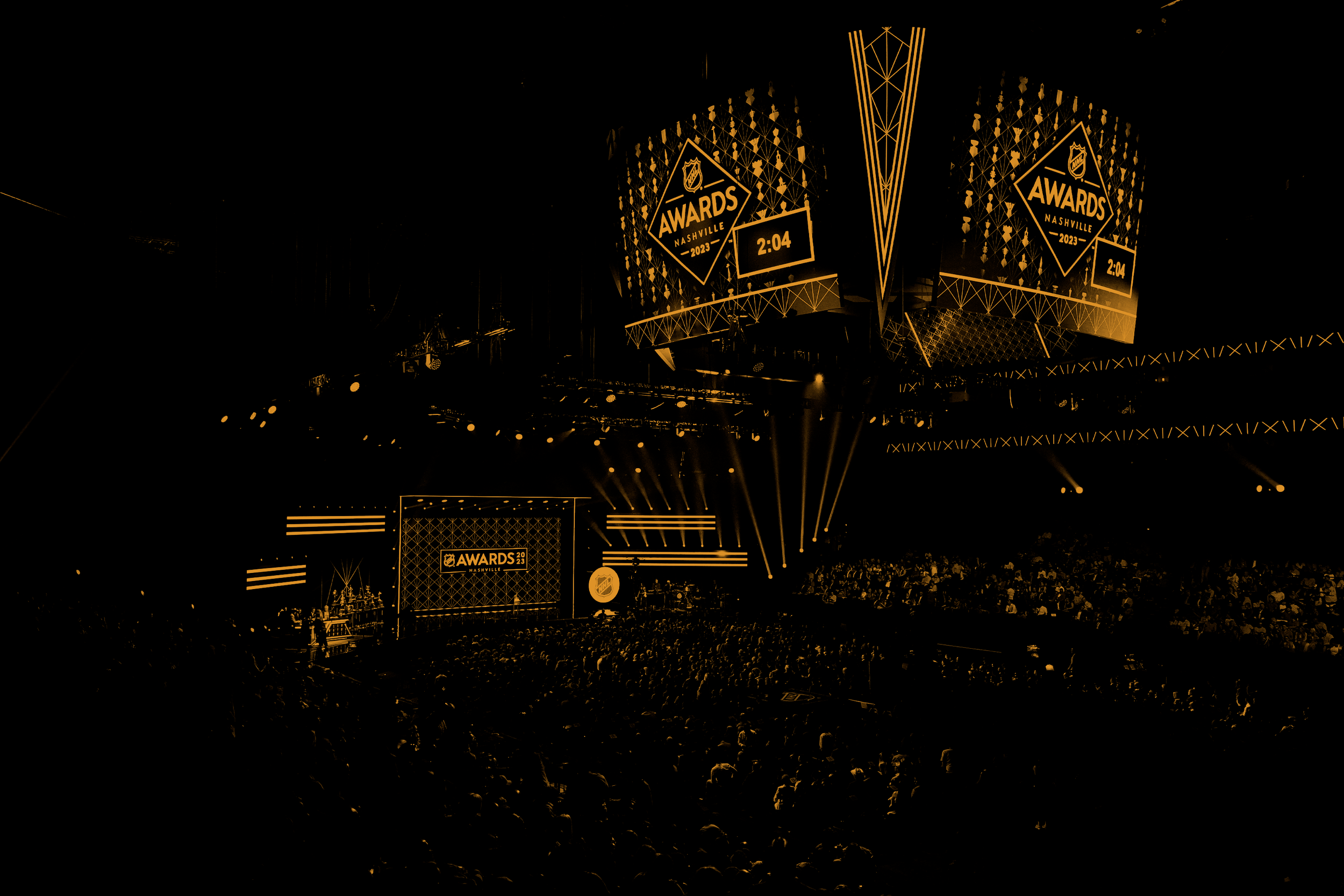

Honoring the league’s best players with 21 prestigious trophies.
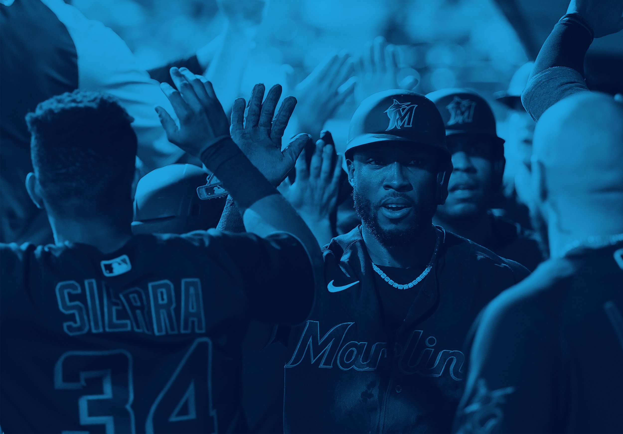

A bold and colorful new look for the Miami Marlins.


WHAT WE DO:
Fanbrandz creates brand assets for professional sports organizations, helping them engage with fans and tell their stories.
We work with CMOs, Marketing VPs, and Creative Directors to develop complete brand identity programs, including primary and secondary logo design, brand guidelines, support art, and style guides.
Developing brand assets is only the beginning. Those assets then become a treasury of brand tools that are passed on to internal marketing teams, ad agencies, broadcasters, and licensees — designers working in print, digital, and environmental graphics. It’s an extraordinary array of creatives all striving to communicate the brand story with one voice. And our toolbox of brand assets provides them with the continuity and flexibility they need to engage with sponsors, business partners, and most of all the fans.
As we share examples from our portfolio, we also celebrate our visionary clients and the talented people who bring these brands to life in activations all around us. Together, we build brands that connect with fans.
Learn more about what we do.

WHAT WE LOVE:
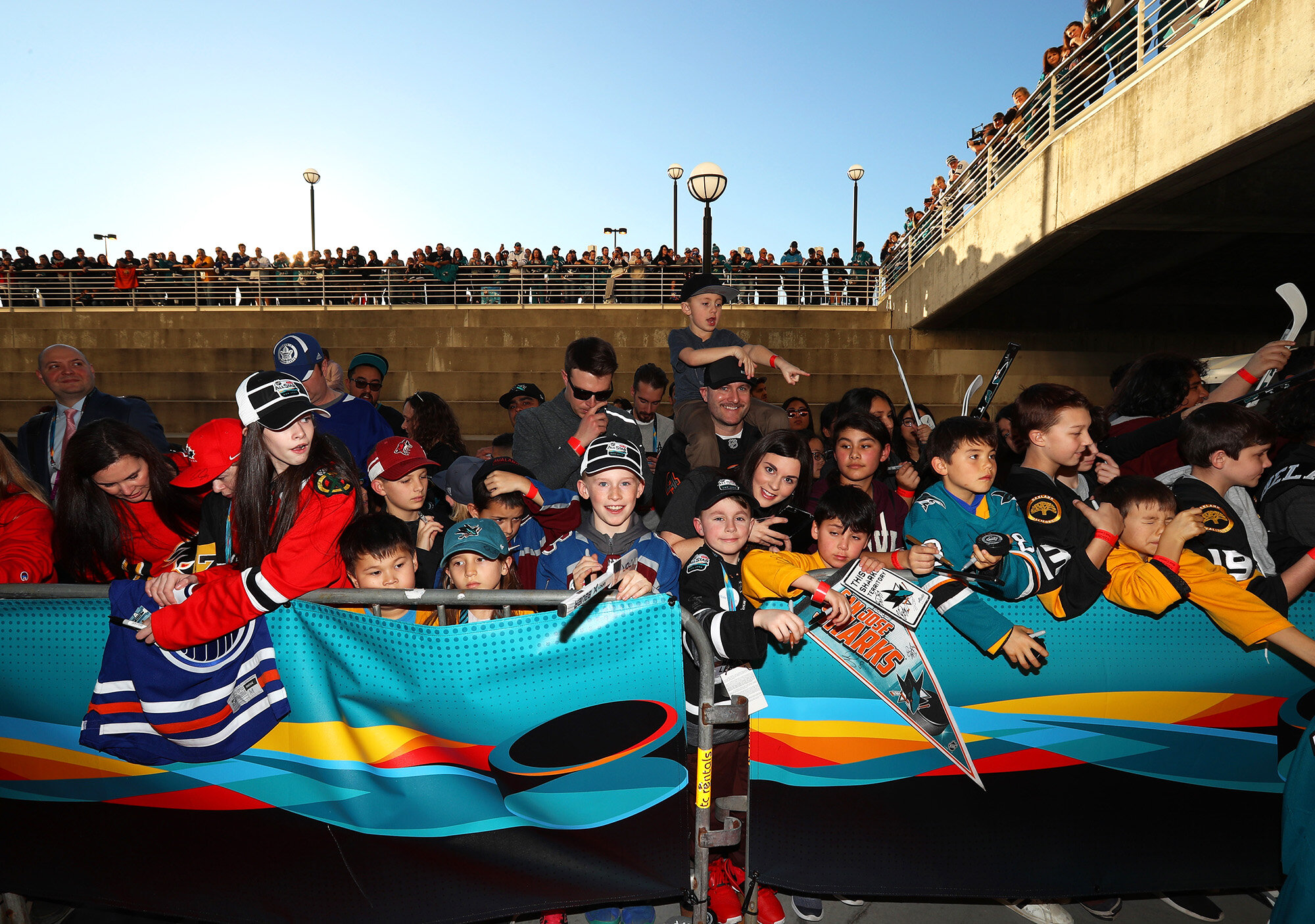
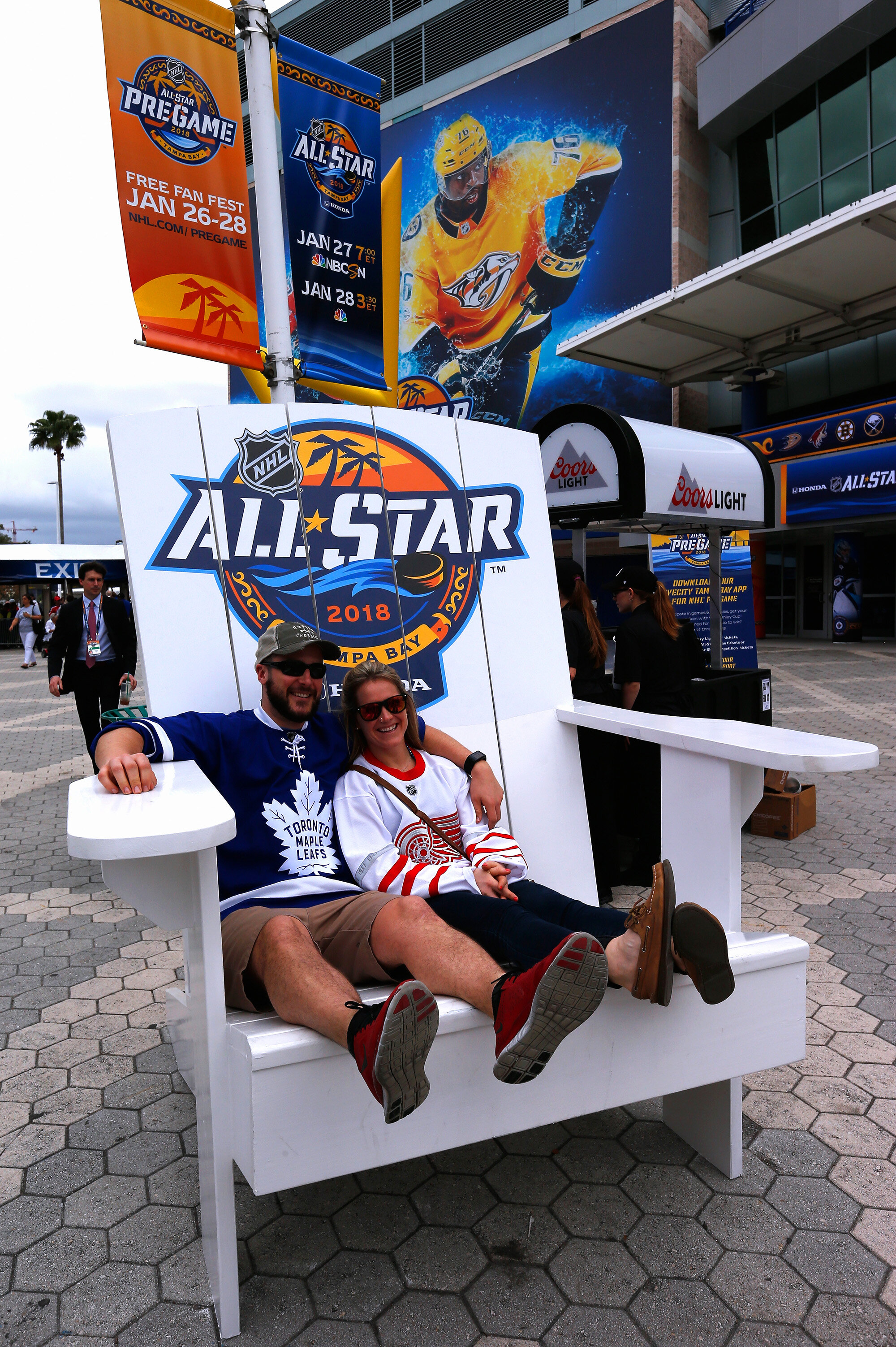
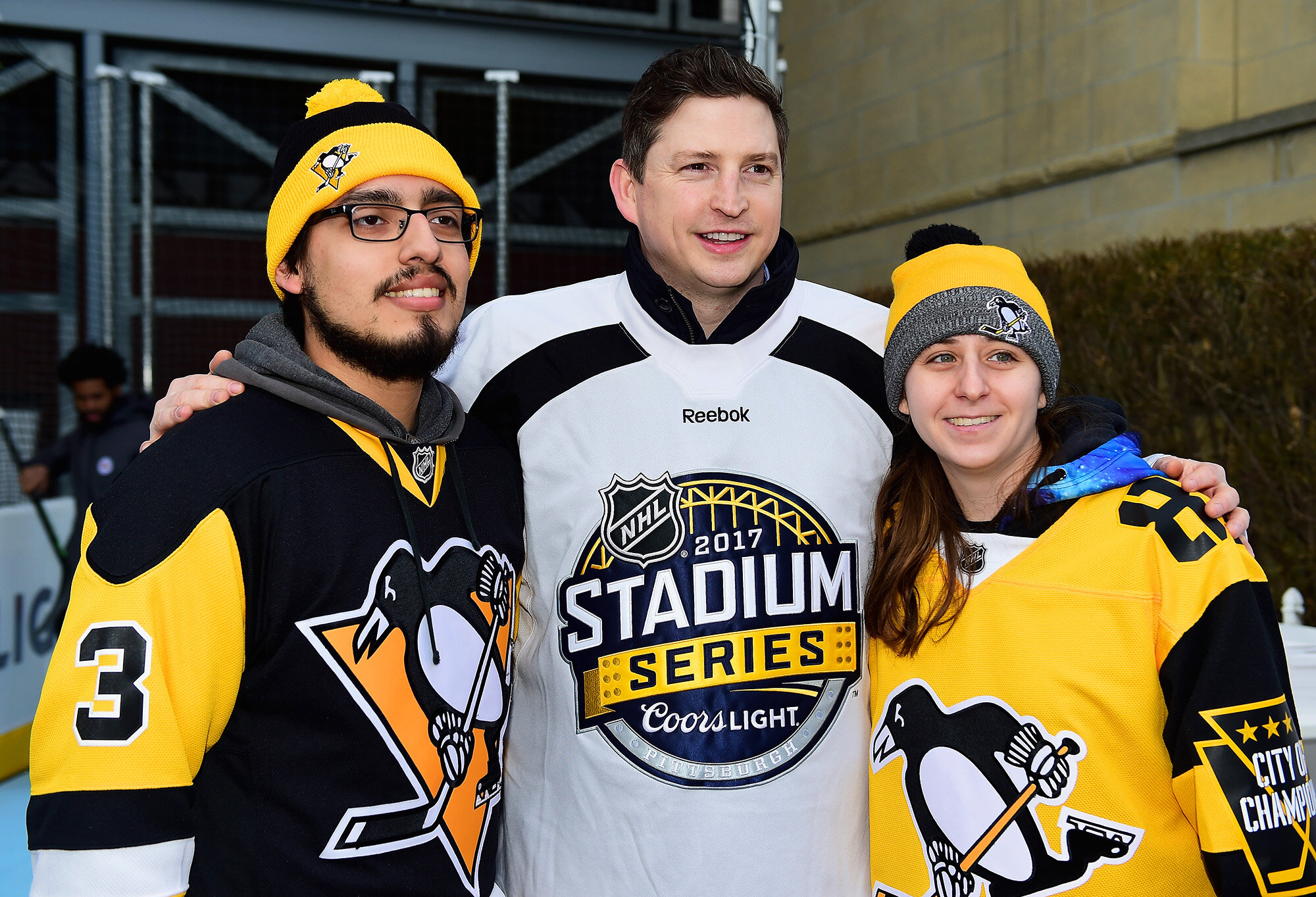
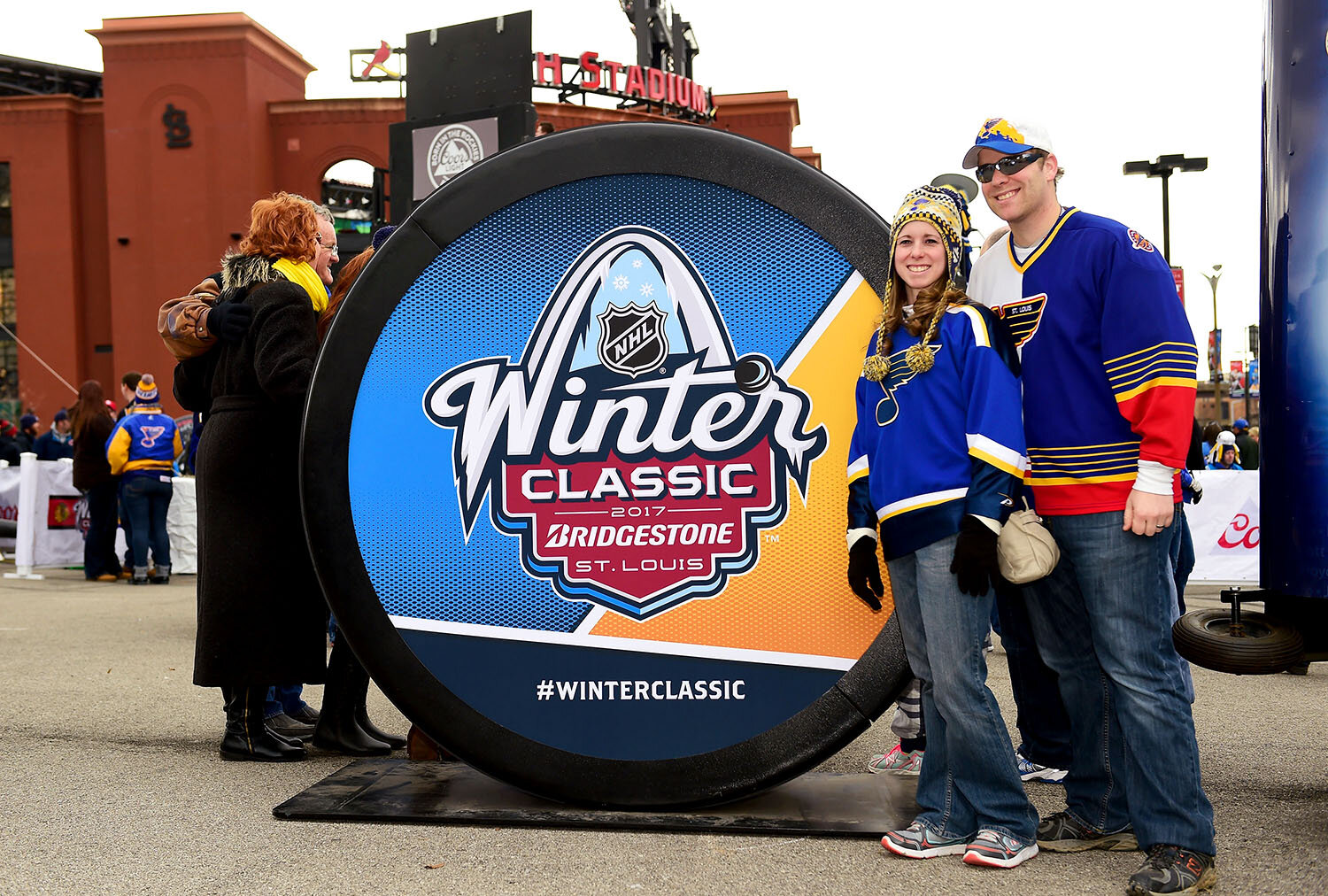
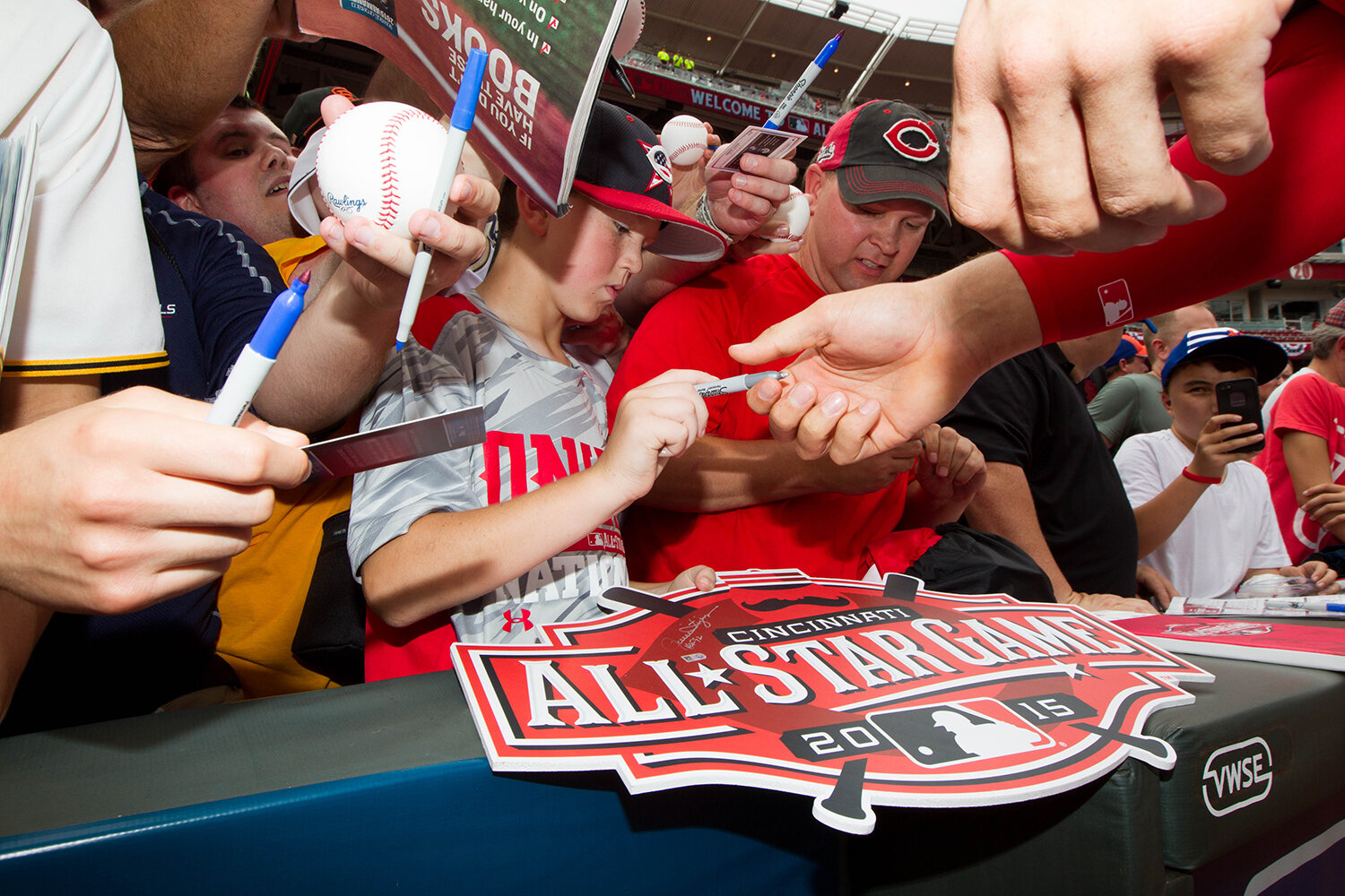
FAN PASSION
What makes a fan sit outside in below-freezing temperatures for over four hours? Passion. And sports teams have the most passionate, devoted, and engaged fans out there.
As a sports branding creative agency, our goal is to increase our knowledge about the relationships fans have with their teams and to find out what keeps those fans so incredibly loyal. We’ve done some field research into the subject over the years, culminating in our “30 Fans” video project about the depth of this fan passion. Check out the videos below.
And if you come across our work out in the wild, take a photo and tag it with the hashtag #connectwithfans!


#CONNECTWITHFANS
What COVID-19 has taught us:
Who could have imagined that 2020 would usher in such a challenging time? A global pandemic, a social justice outcry, a battered economy — all wrapped in a hyper-polarized political environment. Add to that remote work and schooling, social distancing and masks… It’s a lot to take in.
In such a time, we naturally crave escape and the much needed distraction of sports. Sports represents hope and optimism — a touchstone to normalcy. Well, the leagues stepped up.
Fanbrandz wants to congratulate our clients for their monumental efforts in designing environments and protocols that enabled competitive play in the most challenging environment of our times. They developed the bubble concept and have shown remarkable success in keeping players and staff safe. While it was far from what we were used to, they rolled up their sleeves and made it work.
As organizations across the spectrum continue to respond to all that the last several years has thrown at them, the strength of their brands and their leadership is under a spotlight. It’s a moment when either the durability or the cracks in a brand will be laid bare. And it’s a stark reminder as to why we work so hard to develop strong brands in the first place.
Here at Fanbrandz, we are more dedicated than ever to creating robust identities and branding programs that will endure unforeseen challenges and greet returning fans with excitement and newborn optimism.
Give us a call, and let’s talk about your next project.
Some people we’ve worked with:

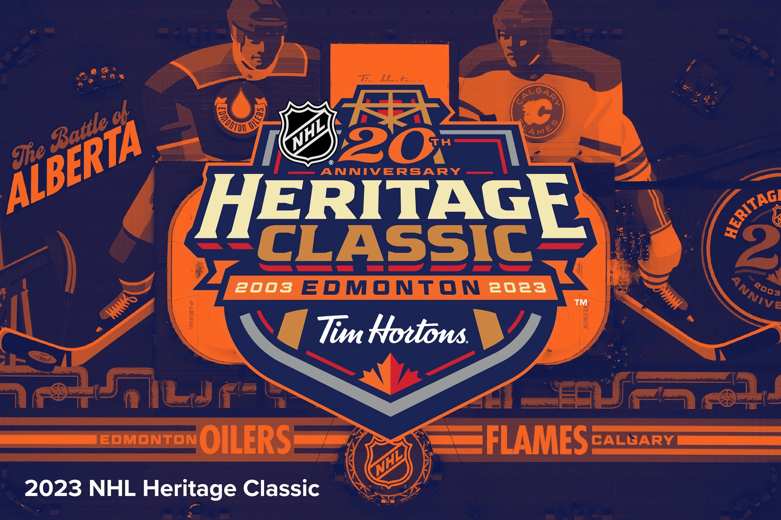
We’ve had the honor of working with some of the biggest names in sports, including major organizations like the NHL, storied franchises like the Boston Celtics, and popular athletic brands such as Adidas.
