OUR APPROACH:
WHAT REBRANDING SPORTS CARS AND SPORTS TEAMS CAN TEACH US ABOUT BRAND DNA
With many sports rebranding projects, a common aim is to reinvigorate a specific part of a franchise’s history that may have been lost: the Brand DNA. Brand DNA can be defined as the words and perceptions contained in memory over time. To extend the metaphor, Brand DNA describes the fundamental elements that lead to the evolution of the brand as a living organism.
The sports car industry reveres Brand DNA much the same way we do in professional sports. Car culture and the pedigree of certain car models have attracted passionate enthusiasts. People covet them. People collect them.
During the 1950s and 60s, while baseball was growing exponentially because people could now watch it on the latest, must-have, household appliance — the television — new, sporty car models were becoming must-have lifestyle brands of their own.
The evolution of the Brand DNA of automobiles syncs up with the evolution of baseball teams over the decades and can provide some very interesting insights.
FORD THUNDERBIRD VS. HOUSTON ASTROS
In 1955, the Ford Motor Company launched the Thunderbird. Introduced as a “personal luxury car,” it was Ford’s answer to the Corvette and Italian sports car imports and featured a sleek, sophisticated body wrapped around a big engine. This is genesis of the T-Bird’s Brand DNA.
As the T-Bird evolved, new features were added such as air scoops, double round headlamps, and more hard geometric lines.
Eventually the Thunderbird’s remodeled and re-envisioned car was nicknamed the Bullet Bird. (This is what Thelma and Louis drove off a cliff.) The Thunderbird continued evolving, getting bigger, more square, and eventually resembling something like the Lincoln Mark IV at three feet longer and 1500 pounds heavier than the original. The Brand’s DNA was being progressively lost to an attempt to “modernize” the car.
This trend continued as the Thunderbird was enlarged to join the other huge sedans, nicknamed “boats.” And still, what was left of the T-Bird took one last unfortunate turn in the 90s when it evolved into a pitiful, generic sedan. Sales slumped and assembly was halted by 1997. The Thunderbird and its sleek Brand DNA were all but gone.
In 2002, after a 5 year hiatus, Ford re-introduced a T-Bird in the image of the original 1955 and 1961 models. It featured porthole windows, air scoops, a Jaguar-designed 252hp V8 engine with the classic egg carton grill. It took 45 years, but the Thunderbird’s Brand DNA and pedigree had been restored.
This is a perfect example of Brand DNA driving the evolution of a brand.
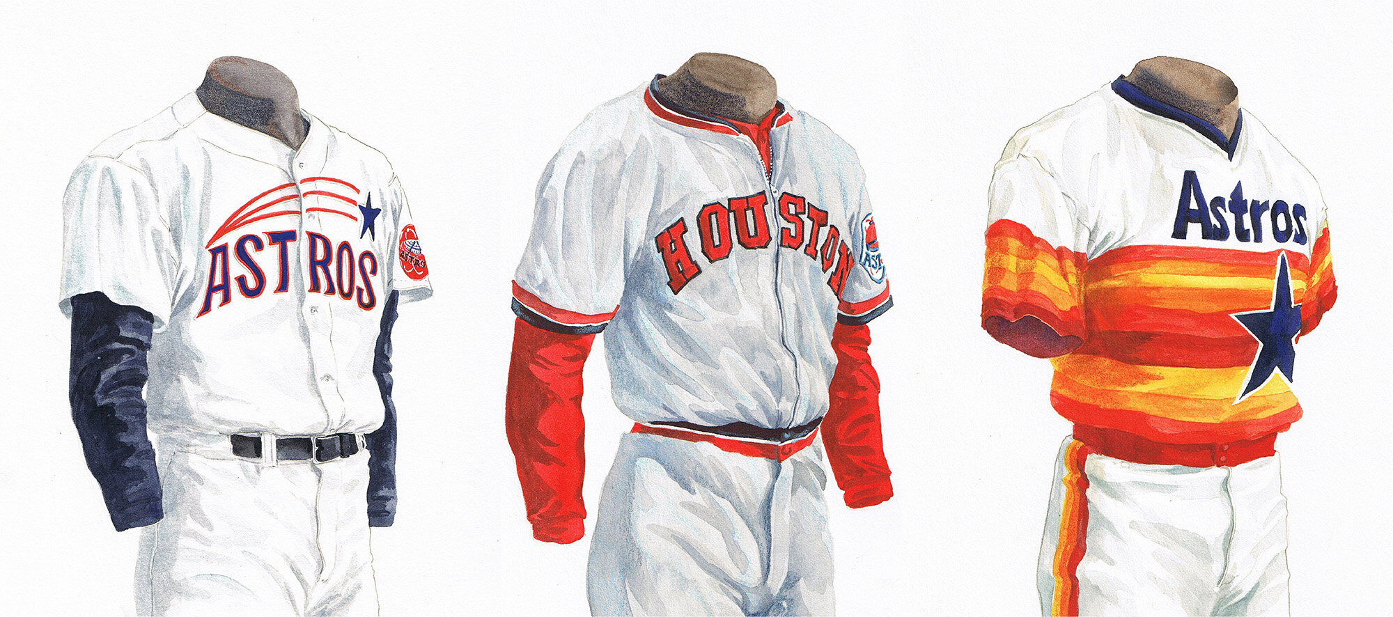
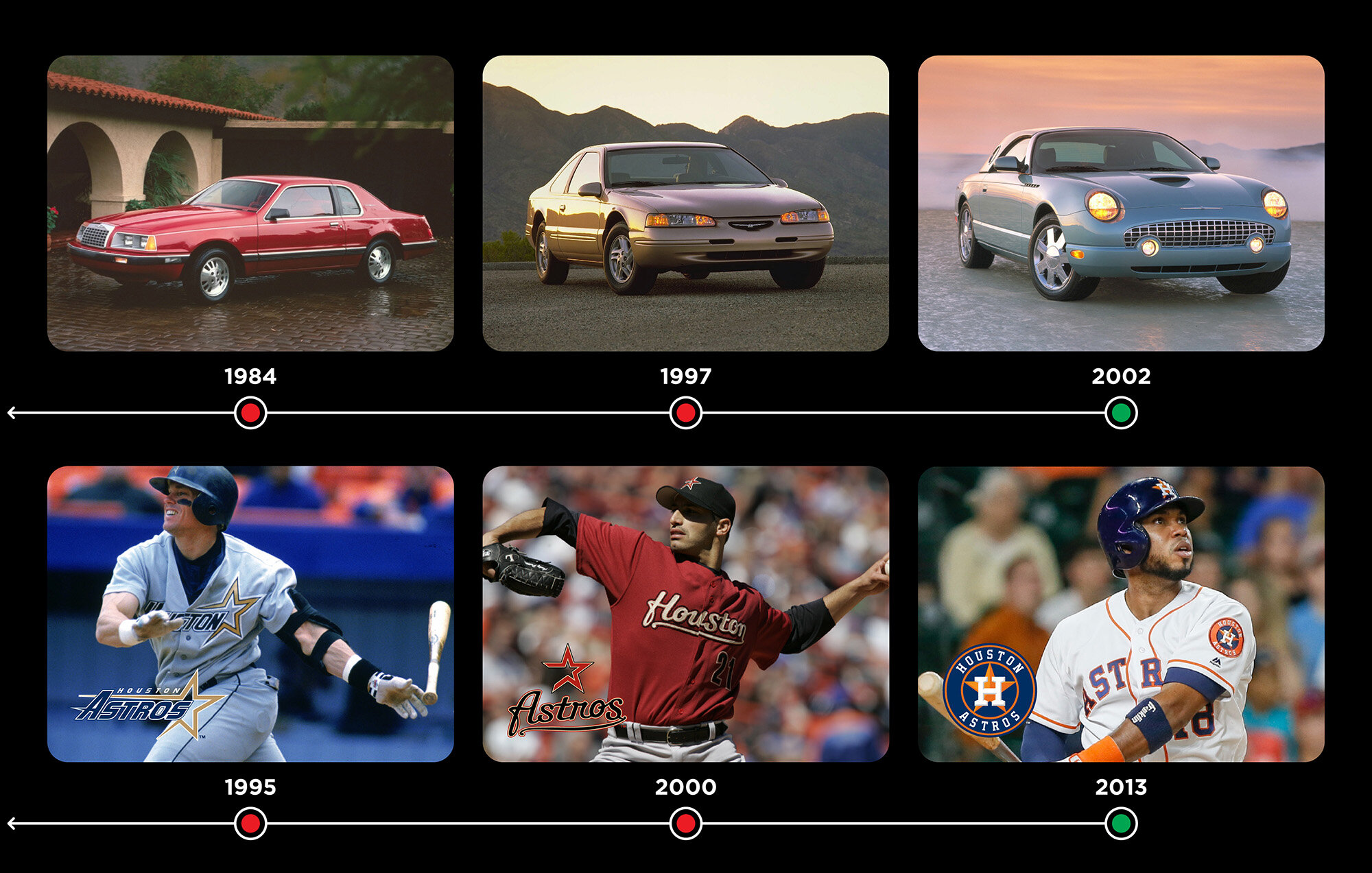
As an expansion team in 1962, the Houston Colt .45s were born, but just three years later moved to the brand new Houston Astrodome and changed their name to the Astros.
It was 1965, and the space race was on. The space center in Houston represented America’s spirit, and the Houston Astrodome was listed as the 8th wonder of the world. The Astros took to the field with Brand DNA comprised of a navy and orange color palette and the star.
However, like the T-Bird, an evolution driven by new ownership in 1992 saw dramatic shifts in brand colors and typography. And, they evolved once again in 2000 when the club adopted the corporate colors of its new owner’s business, the McLane Company. At this point, nothing from the brand’s original 1965 Brand DNA remained.
Much the way the Thunderbird found itself unmoored and unsuccessful, the Astros decided they wanted to reconnect with the spirit and intent of the original brand and pedigree.
The original navy/orange color palette was restored and the star in its original and pure configuration was restored. The unveiling was a welcome to something both deeply familiar but also new and invigorated.
You can see the evolution of both the T-Bird and the Astros in the slides below.


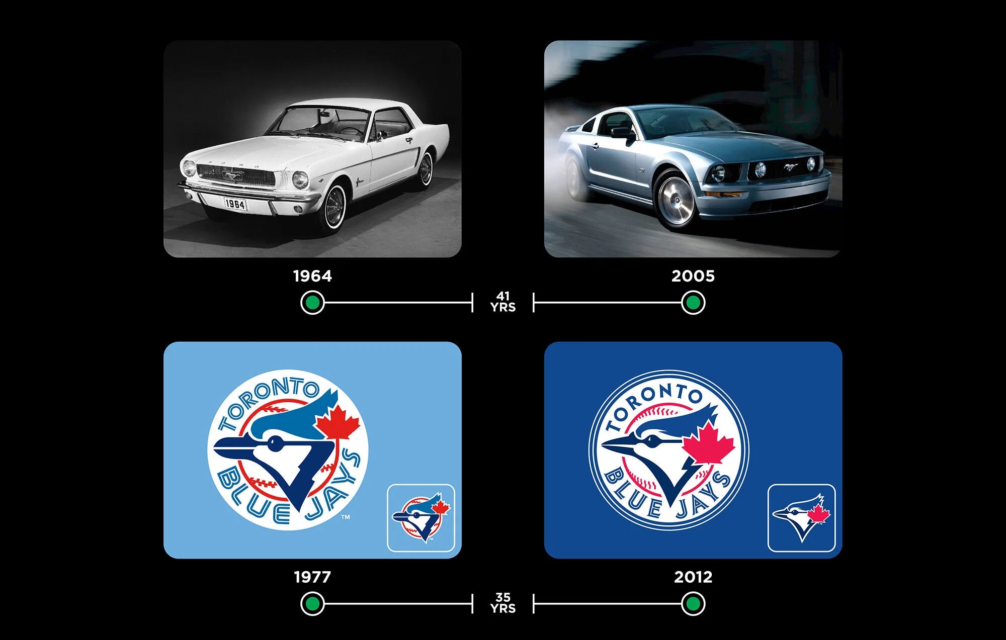
FORD MUSTANG VS. TORONTO BLUE JAYS
For another study, we looked at a classic muscle car: the Ford Mustang and matched it with the Ford Mustang.
When it debuted at the World’s Fair in New York, its unique American-made sportiness and power made it an instant success at $2300 and available with a 241 horsepower engine. Ford doubled down on its power in 1967 when it started offering a Shelby engine with upgraded tires and a racing suspension. This car was hot and fast.
After years of redesigns, Mustang was depleted to a 4-cylinder entry-level coupe. The Brand DNA was lost. Noticing a downward trend in sales, Ford introduced a new redesign in 1999 that attempted to recapture the magic of the original, featuring a V8 GT model.
It took forty years after its inception that the Mustang was truly reborn and its mojo restored. Ford had finally course corrected its Brand DNA and sales surged once again.
When brands start to drift away from what made them great, sometimes you need to step back and analyze what went wrong.
Over the years, the Toronto Blue Jays identity had evolved, phasing in larger maple leaves and diminishing — and finally replacing — the split typography. Eventually by 2004, all vestiges of the original Blue Jays brand had been replaced. The Canadian leaf was removed, the word “Toronto” was gone from the primary logo, the word “Blue” had disappeared, and their eponymous blue color had been minimized. The original brand that was associated with their back-to-back World Series wins in 1992 and 1993 was completely gone.
Fast forward to 2012, all components from the original 1977 identity have been brought back and thoughtfully evolved. The Brand DNA was restored with a dominant blue color, a new blue jay, a Canadian leaf and the split custom font.


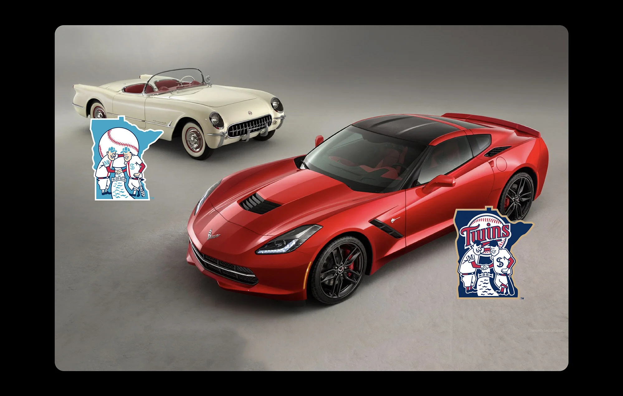
CHEVROLET CORVETTE VS. MINNESOTA TWINS
While the previous pairings demonstrate Brand DNA gone off-the-rails then recaptured, we also identified an example of the faithful preservation of Brand DNA through the decades: The Chevrolet Corvette and the Minnesota Twins.
The Corvette instantly become possibly the most iconic American-made car ever, period. Its coolness immediately demanded a nickname: the “Vette.” The early models were produced in Polo White, Pennant Blue, Sportsman Red, and black. While changes such as quad headlights and exhaust tips and engine block size and fuel injection performance features were added and modified, throughout its evolution, it never lost touch with its origin. Today, you can find a Corvette specific car show where faithful enthusiasts spend hours admiring Vette models through the years where the pedigree and blood lines are undeniable.
The Minnesota Twins franchise is actually a rebrand of the previous Washington Senator — but once the club arrived in the midwest in 1961, they established their identity around their community comprised of Minneapolis and St. Paul — known locally as the Twin Cities.
The iconic Minnesota state holding shape contains “Minnie” wearing a Minneapolis Millers uniform and “Paul” in a St. Paul Saints uniform, shaking hands across the Mississippi River. Along with the Minnie & Paul illustrations, the unique typography has evolved respectfully through the years. Their Brand DNA is intact.
The Yankees, too, have fiercely preserved their identity over time, tolerating only very minor alterations.


FORD TAURUS VS. TAMPA BAY RAYS
Sometimes a Brand’s DNA doesn’t have enough equity to be brought back or reinvented. The Ford Taurus was introduced as an entry level, bland sedan that underwent minor uninspired updates over its 30+ year life. After a sharp decline in sales in the early 2000s due to competition from the Japanese market, the Taurus model was retired and replaced with Ford’s new line of midsize sedans.
But the Taurus name still carried some equity with it, so in 2010 the 6th generation Taurus was unveiled. It was a complete reinvention of the car, with all vestiges of its past life gone and only sharing a common name with its past self. No longer a boring sedan, it was introduced with all the bells and whistles of modern day luxury cars. On top of this, a high-end sports car model was also produced, dubbed the SHO (Super High Output) boasting a twin-turbocharged gasoline direct injection V6 engine with 365 horsepower. The new Taurus was a new brand using an old name.
In the case of the Tampa Bay Devil Rays, a similar complete overhaul was in order. The Devils Rays had been in a deep rut for many years finishing at the very bottom of the 30 MLB clubs.
So, when New Yorker Stuart Sternberg purchased the franchise, he immediately went to work with his ex-Wall Street star, Matt Silverman, to make big changes throughout the organization, including reinterpreting the name Ray.
Previously, Ray referred to the marine animal, the sting ray. The new interpretation would represent a more aspirational “ray of (Florida) sunshine.” With the name change, we developed a more dignified, mature and understated identity and uniform program without any unnecessary flourishes. The classic lettering features a glint of sunshine as an homage to the Florida sun.
With all of the substantive changes around the front office and on the field, the Rays famously went from “worst to first,” winning the American League pennant under the new identity and wearing the new uniforms. The Extra 2%, a book written by Jonah Keri with a forward by Mark Cuban, chronicles the amazing transformation of the franchise from bottom up — and we get some ink around page 166!


REBRANDING FROM THE ROOTS
Brand DNA is contained in memory.
A brand is a living organism, and runs deep in the culture of sport.
It’s tribal.
It’s passed down through generations.
It connects the past with the future.
Whether introducing a new brand — or engaged in a rebranding — the roots should run deep. The foundation should be sturdy enough and support inevitable evolution without losing its sense of self. The process should ensure a deep level of integrity before considering the design aesthetic. If approached correctly, a great aesthetic will flow naturally from the process.