

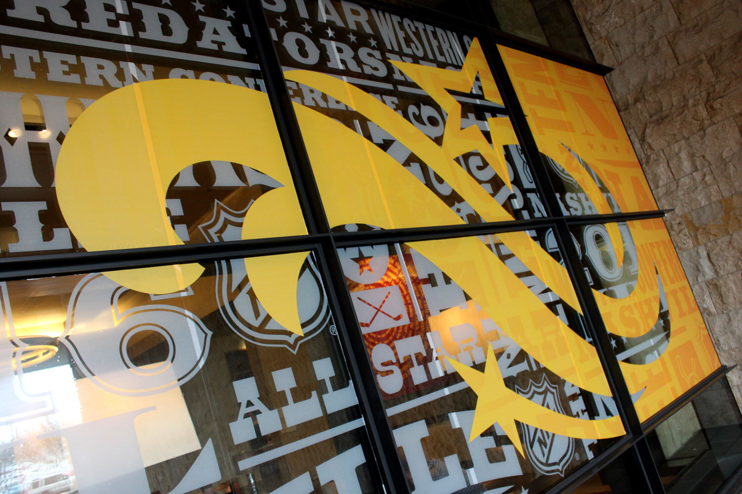
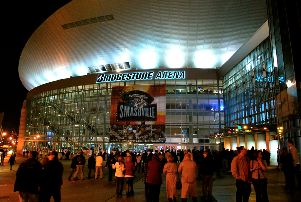
The impressive Bridgestone Arena empties onto lower Broadway and its dozens of famous honky-tonks from Tootsies to The Stage to Legends Corner. The abundance of neon signage, flashy guitars, and music culture inspired the expressive typography and flourishes that make this identity unique to Nashville.


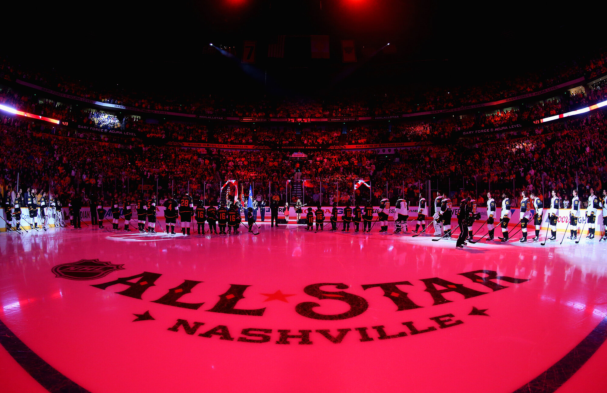


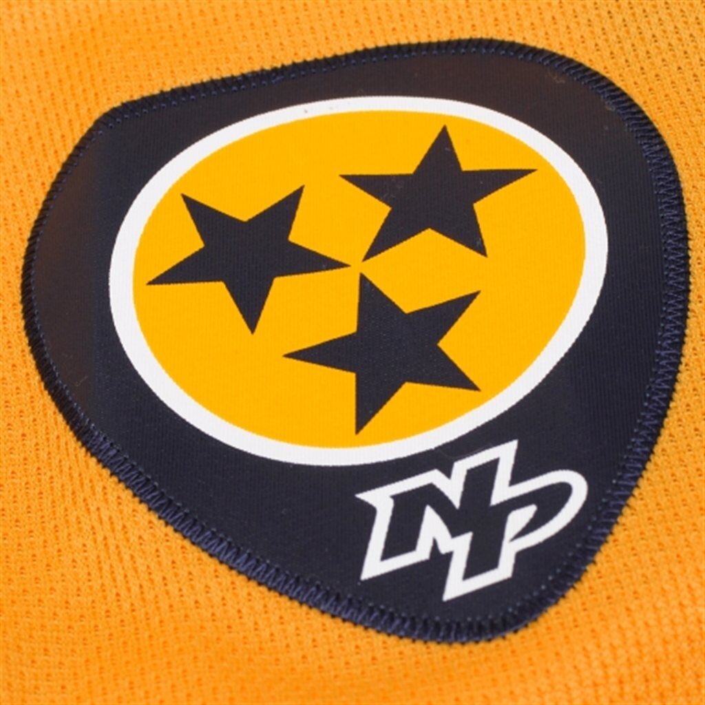
Music is ubiquitous and even inspired the Predators to incorporate a guitar pick in their secondary logo worn on their shoulders, which went on to inspire the overall shape of this All-Star identity.
The cultural influence of music is inescapable and with that comes all of the trappings of musical performing; guitars, intricate mother of pearl inlays in the headstocks, cowboy style shirts and suit jackets with decorative embroidery. Every detail of the mark, from the guitar inlines down to the three-starred puck, was inspired by the rich culture and history of Nashville and its music scene.
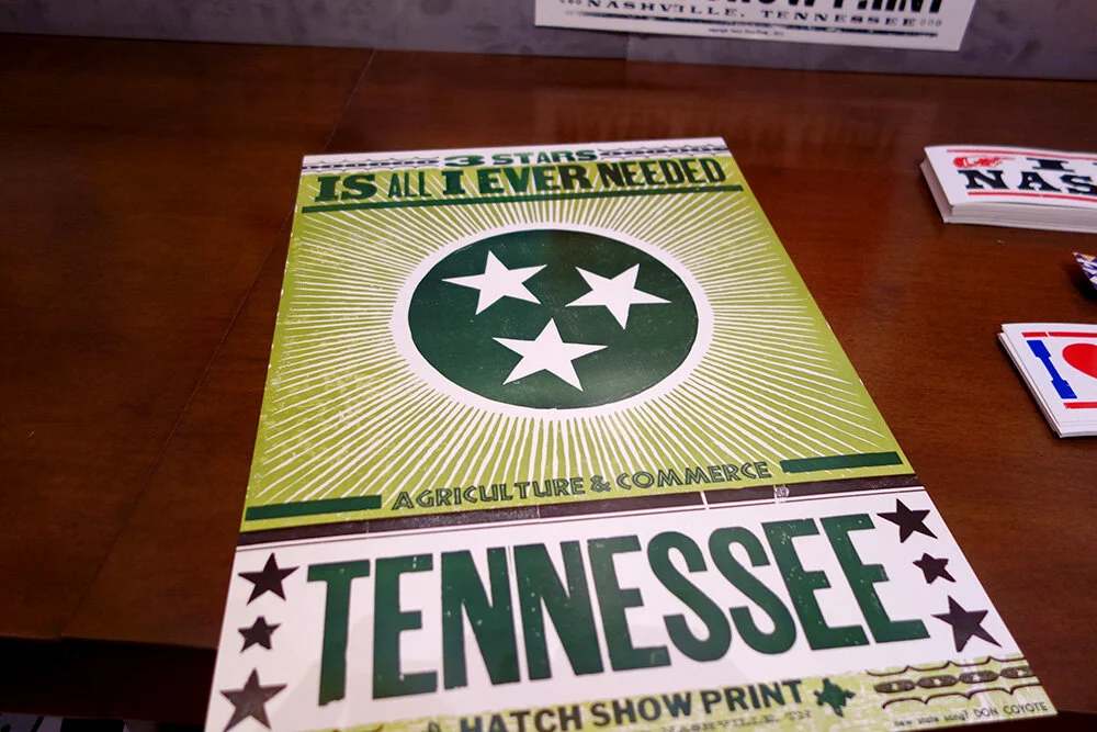
We also spent time at the legendary Hatch Show Print press, where for over half a century, they have designed and printed beautiful music posters announcing great talent around town. Their stye is distinctive and adds to the rich visual vernacular of this city, and inspired much of the theme art that will live alongside the Nashville All-Star identity.
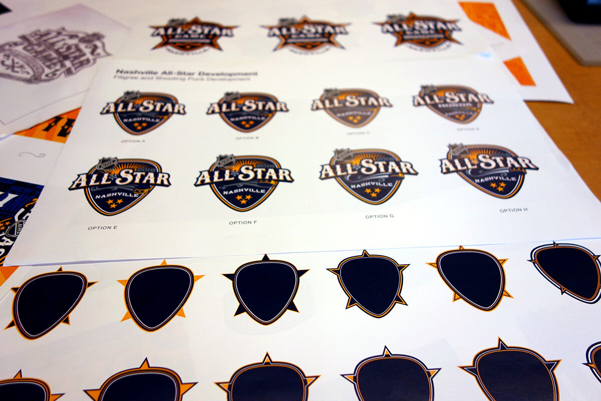
Once we lock down the style guide, the design continues with the next group of partners in the chain doing the activation in all shapes and sizes. But, most striking is the fabulous decor program that NHL’s Paul Conway developed with best-in-class Infinite Scale for in-arena and city-wide environmental graphics installations. Bravo!
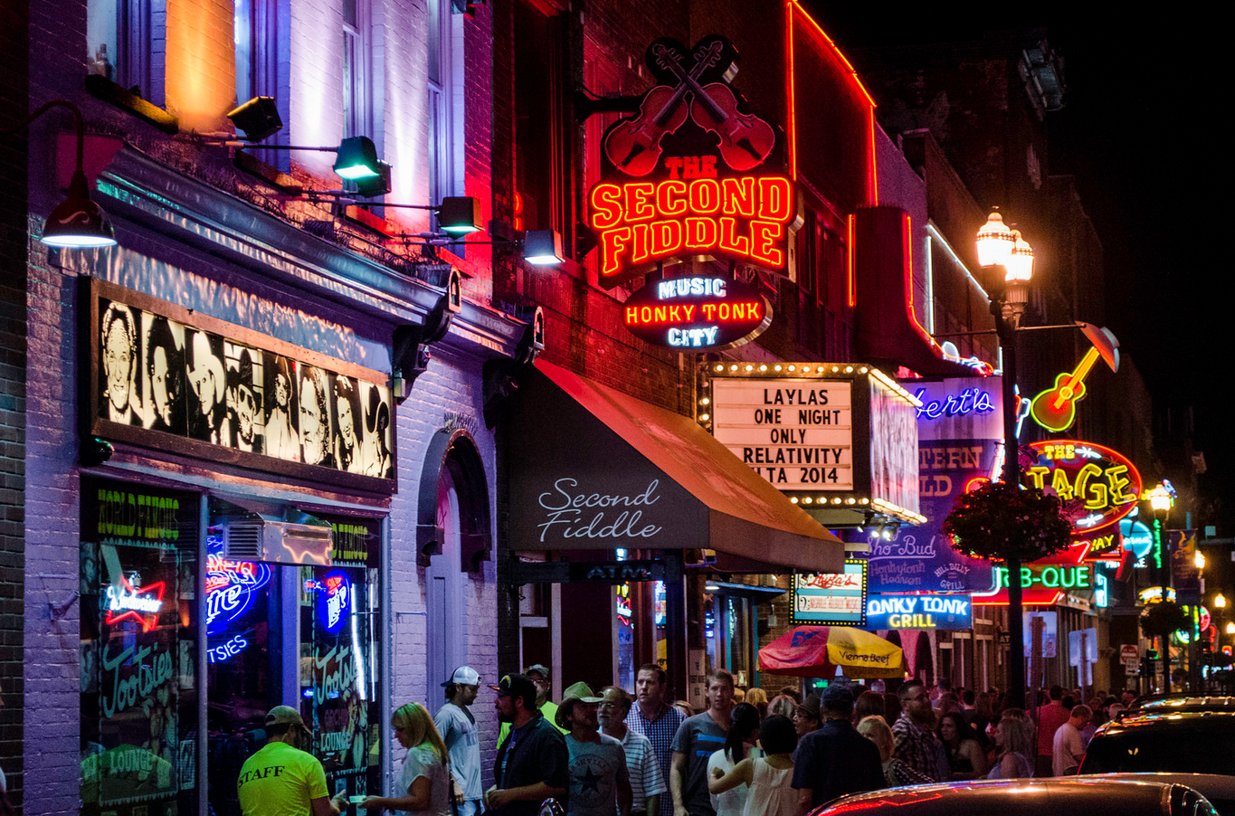
![9657 Nashville, Tennessee - Discover Nashville Tour - downtown Nashville Broadway Street -The Second Fiddle Honky Tonk[3].jpg](https://images.squarespace-cdn.com/content/v1/5ec54d56403a506c53009bab/1603126176754-CS8OEWV3M32PL2891AVA/9657+Nashville%2C+Tennessee+-+Discover+Nashville+Tour+-+downtown+Nashville+Broadway+Street+-The+Second+Fiddle+Honky+Tonk%5B3%5D.jpg)


Client side Creative Direction: Paul Conway, NHL VP Creative +++ Environmental Graphics : Infinite Scale +++ On-site Photography: Getty Images