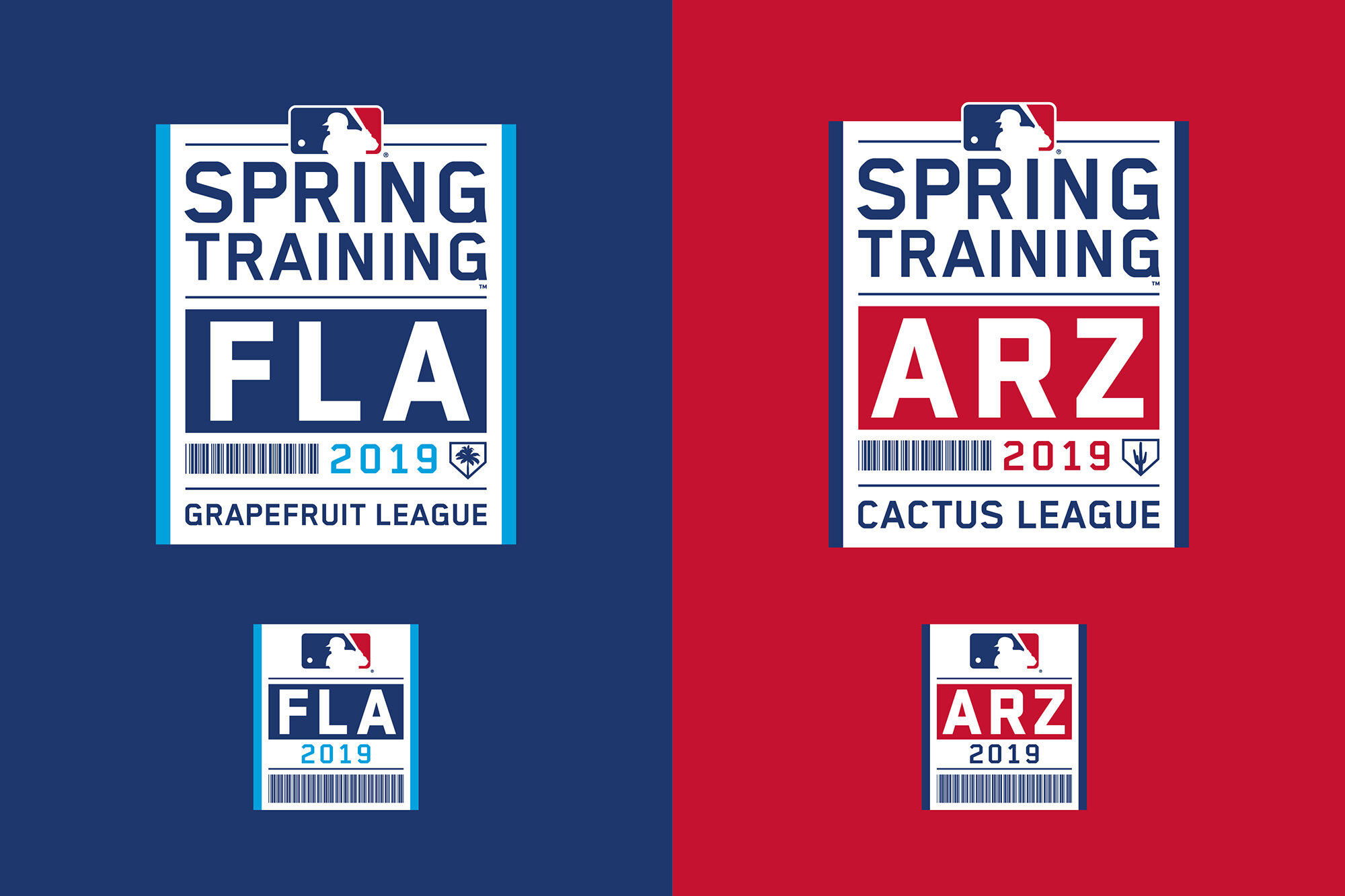
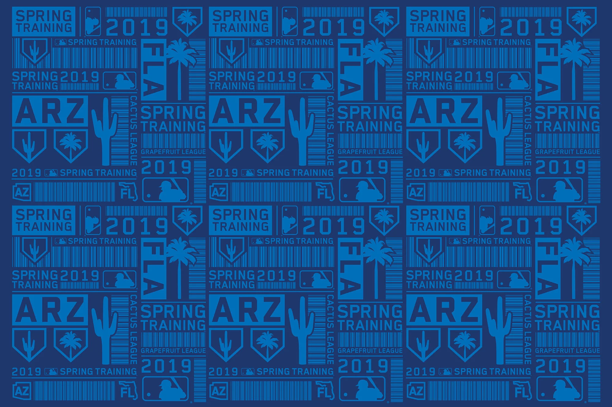
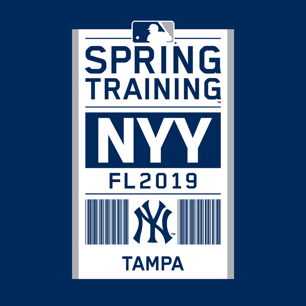
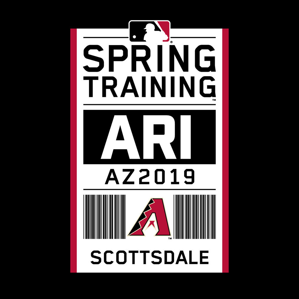
2019
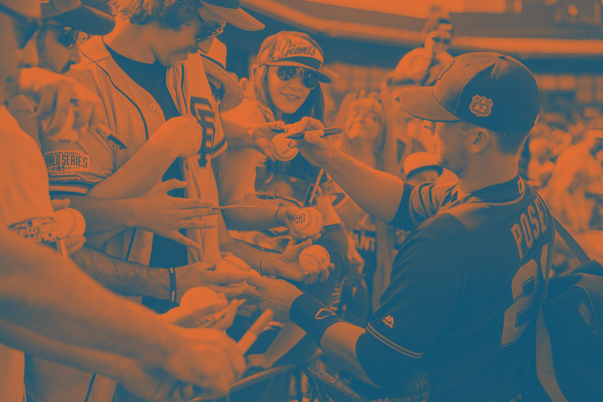
Spring Training games involve a lot of flying, for both the players and the fans. It’s the singular moment in the MLB season where everyone packs into planes and flies away to the warm weather of Florida and Arizona. We wanted to tap into this unique baseball phenomenon with the 2019 Spring Training identity. We took a concept unique to airports and flight - the humble luggage tag - and stripped out and reinvented all of its elements, such as the three letter city codes, colored stripes, small one-color airline icons, and even working barcodes that translate to phrases such as “Spring Training” and “Play Ball.”


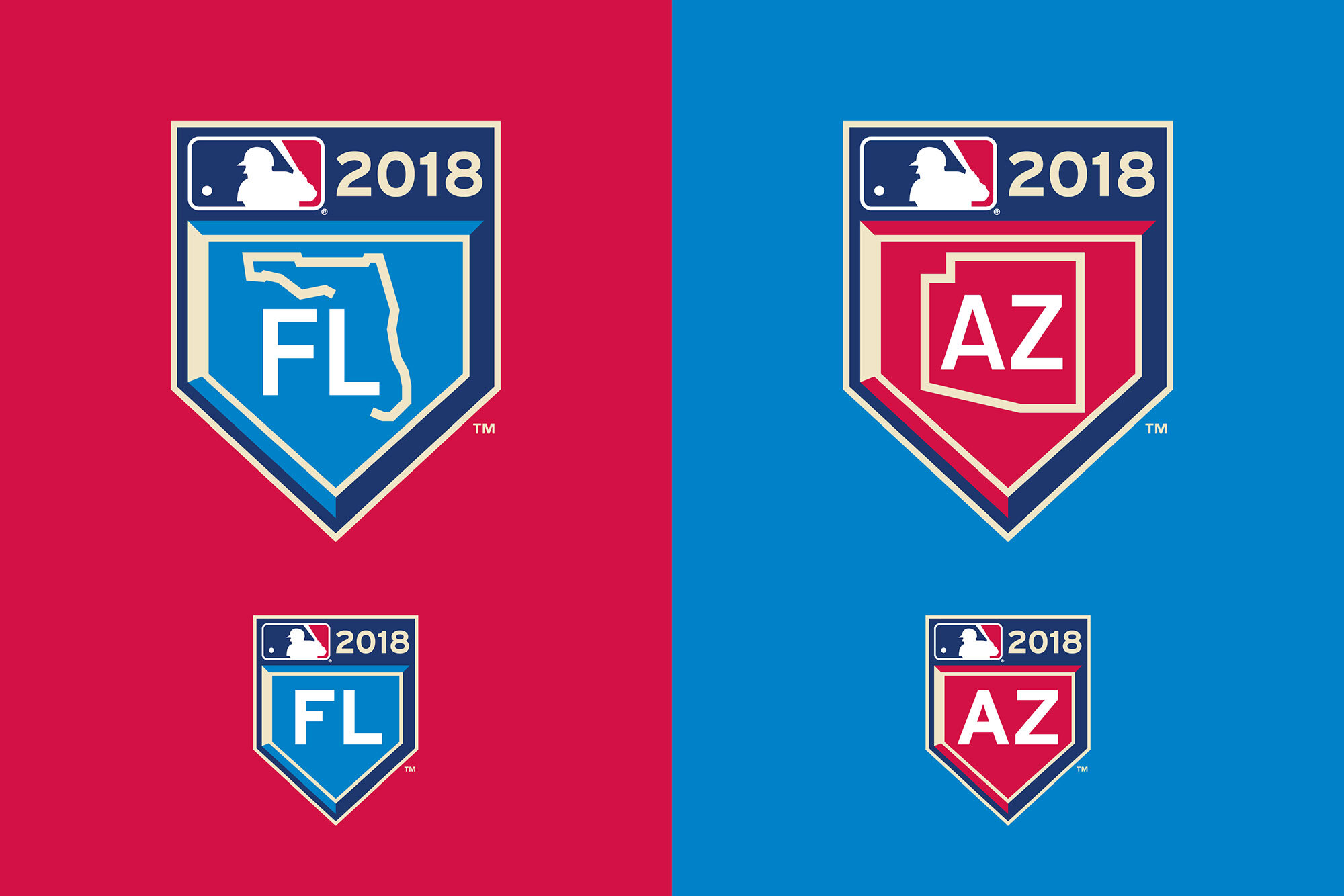
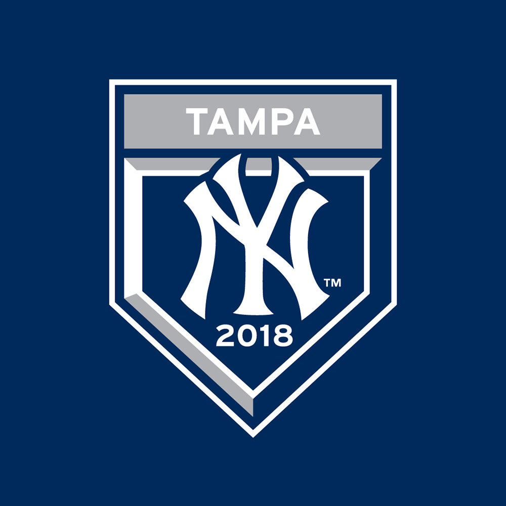
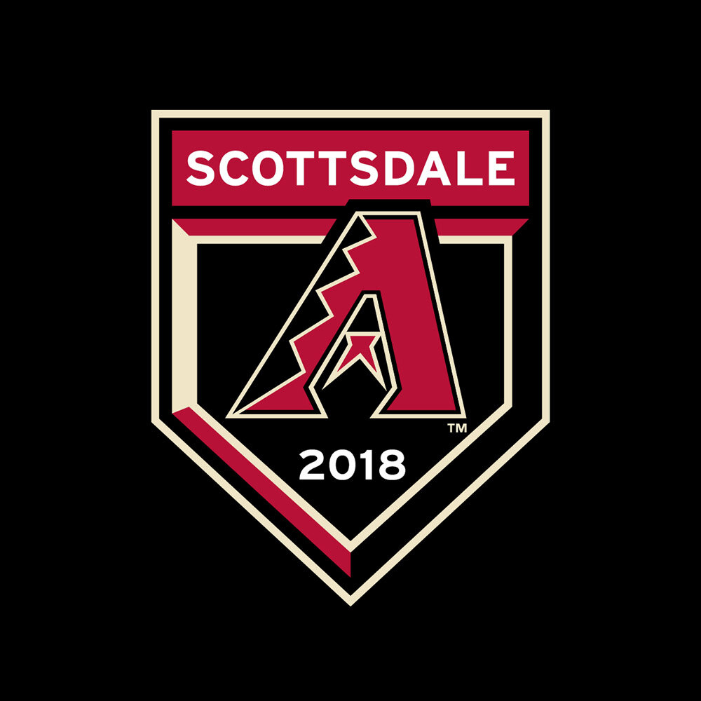
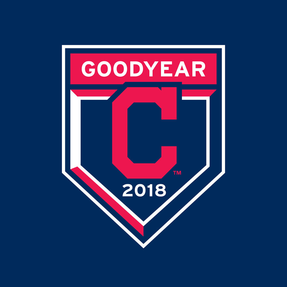
2018
For the 2018 Spring Training Program, we simplified the core package of art and focused in on unique “AZ” and “FL” patches that would be worn on all players’ sleeves. We created two unique sleeve patches using the home plate as a holding shape, and used highway sign interpretations of state shapes to hold the locations. Each team was then given their own version of the patch showing off their Club colors and location of their Spring Training stadium.


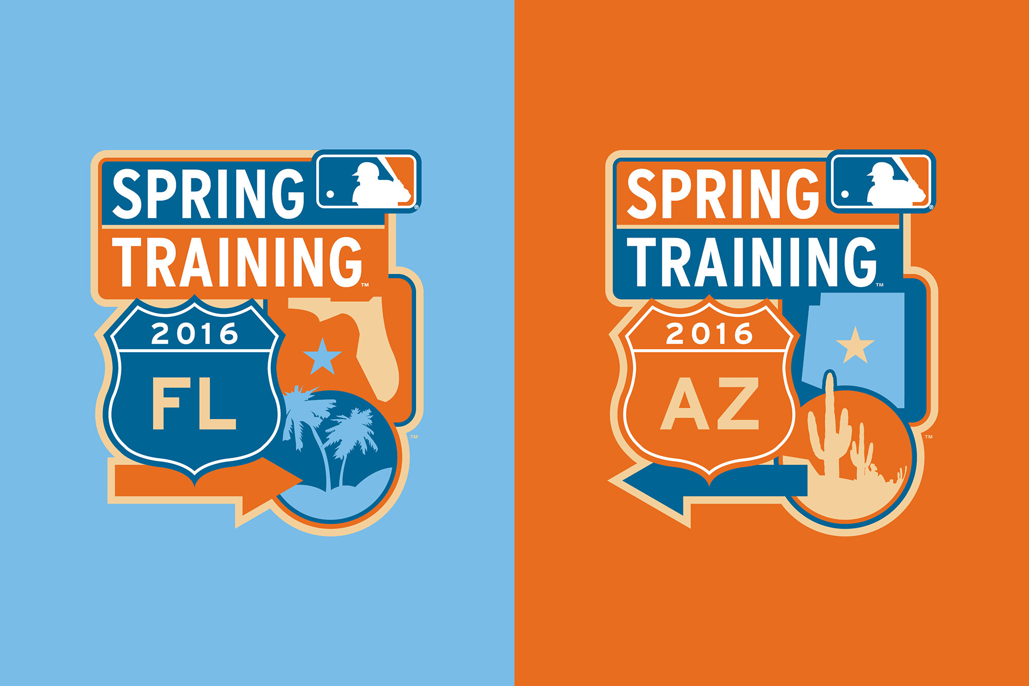
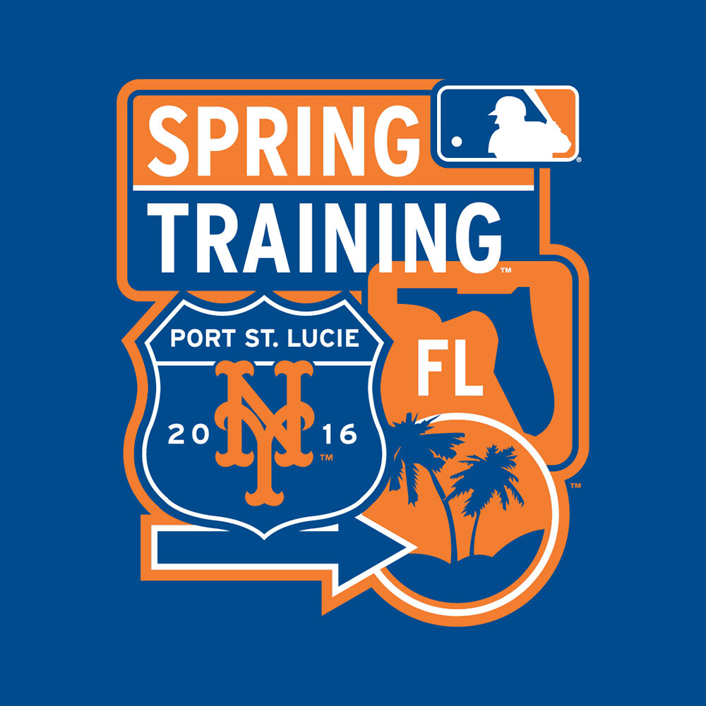
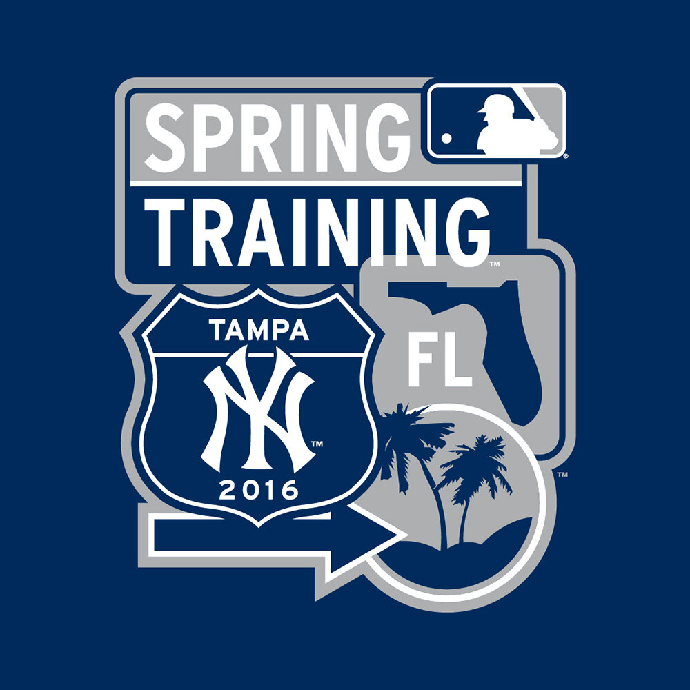
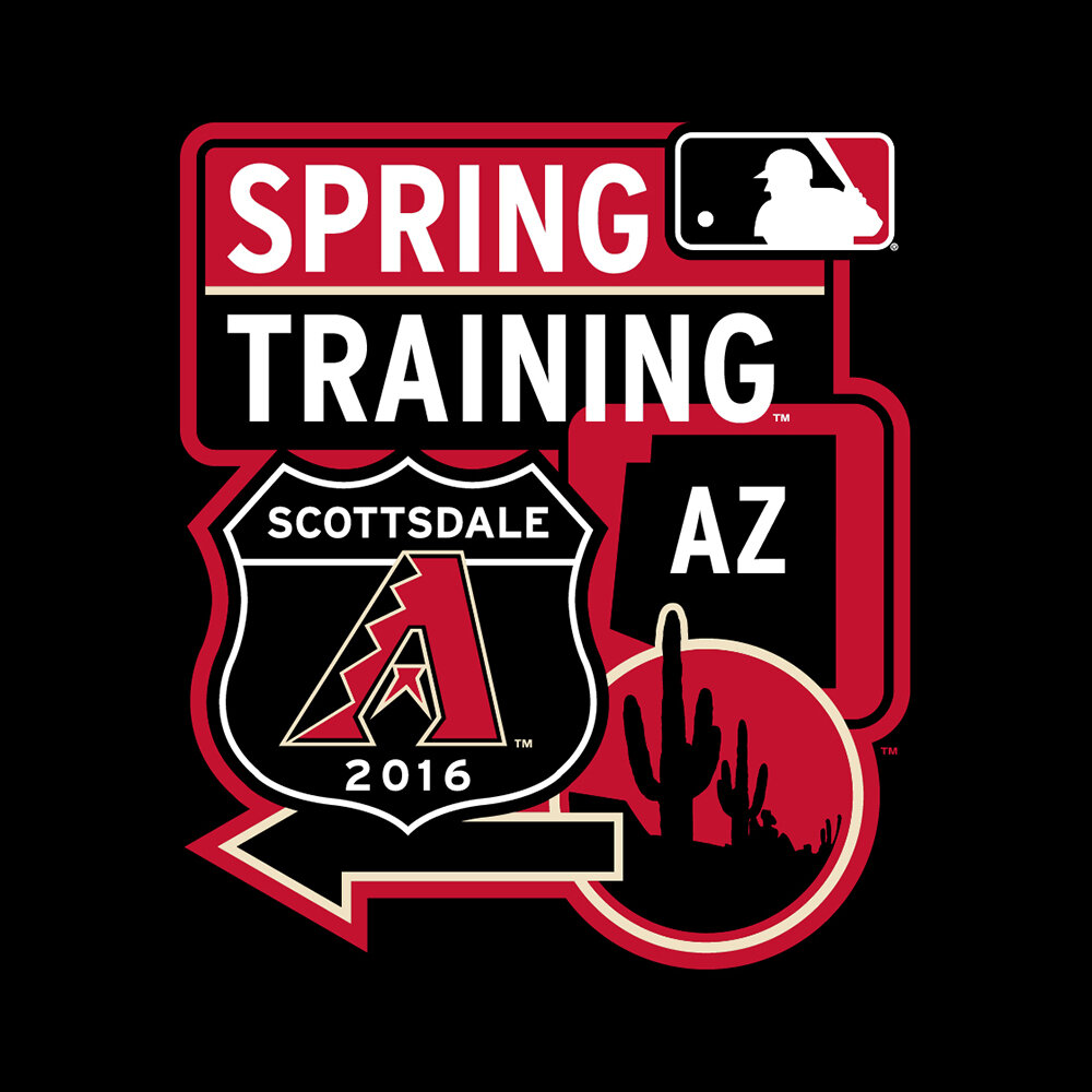
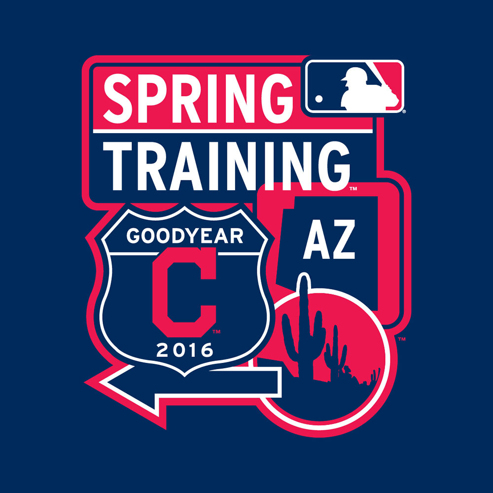
2016
Naturally, Spring Training programs are always the most fun projects to work on, and for 2016 the theme of the program revolved around something core to the Spring Training experience.. road trips. Each year fans will take to the roads and head to warmer weather to experience the beginnings of the new baseball season. The road trip theme flows through all parts of this Spring Training identity, including the primary marks and team crests inspired by the many highway signs you'll come across during your journey to one of the Spring Training ballparks.


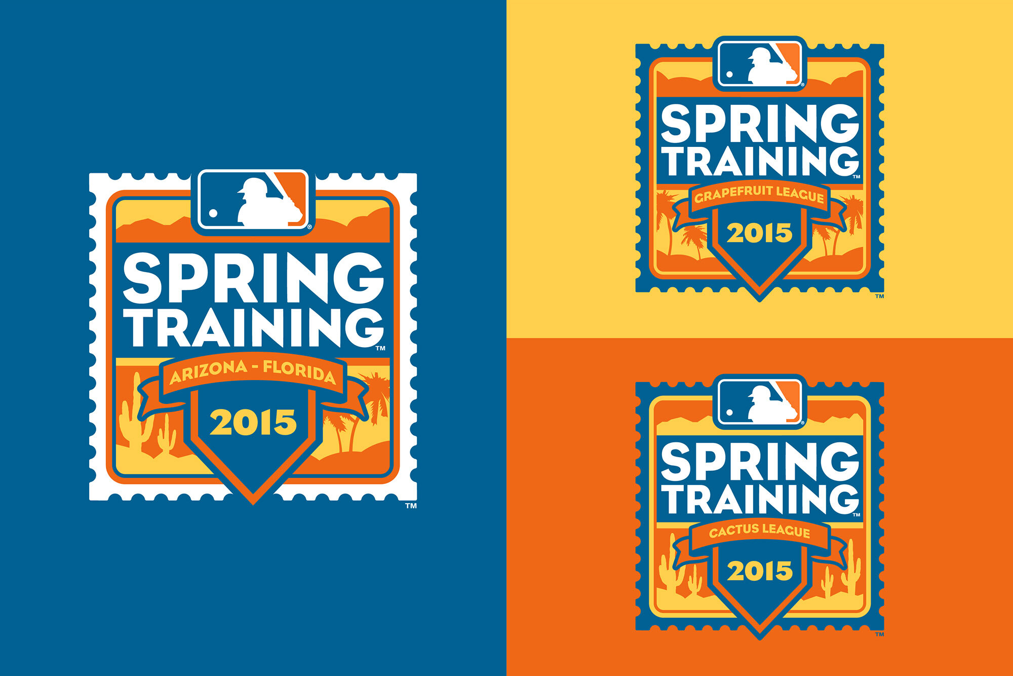
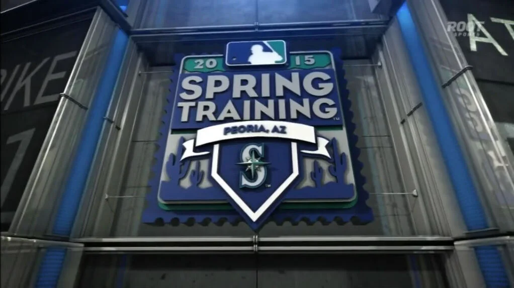
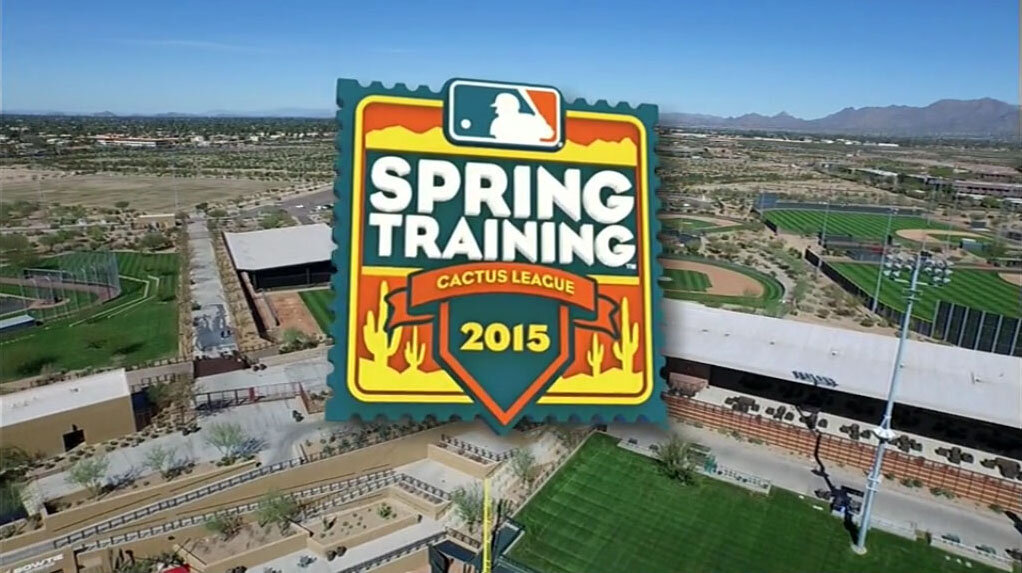
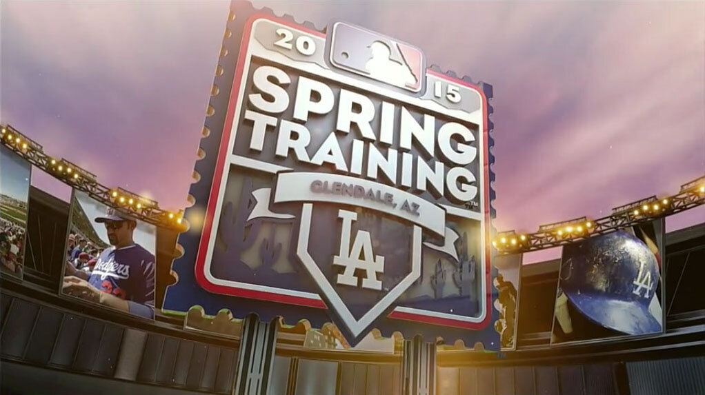
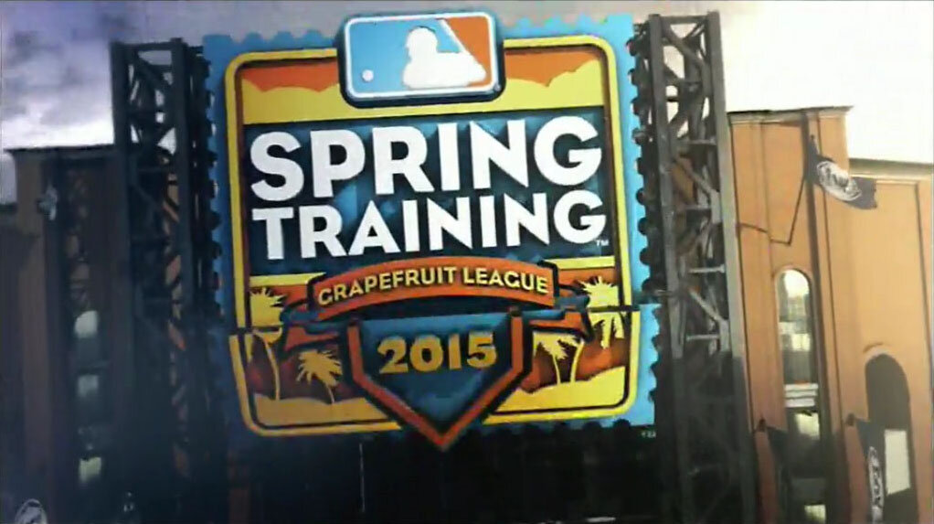
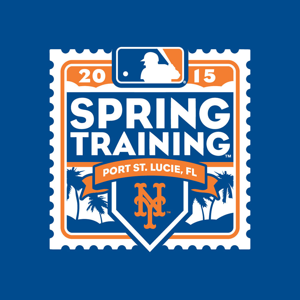
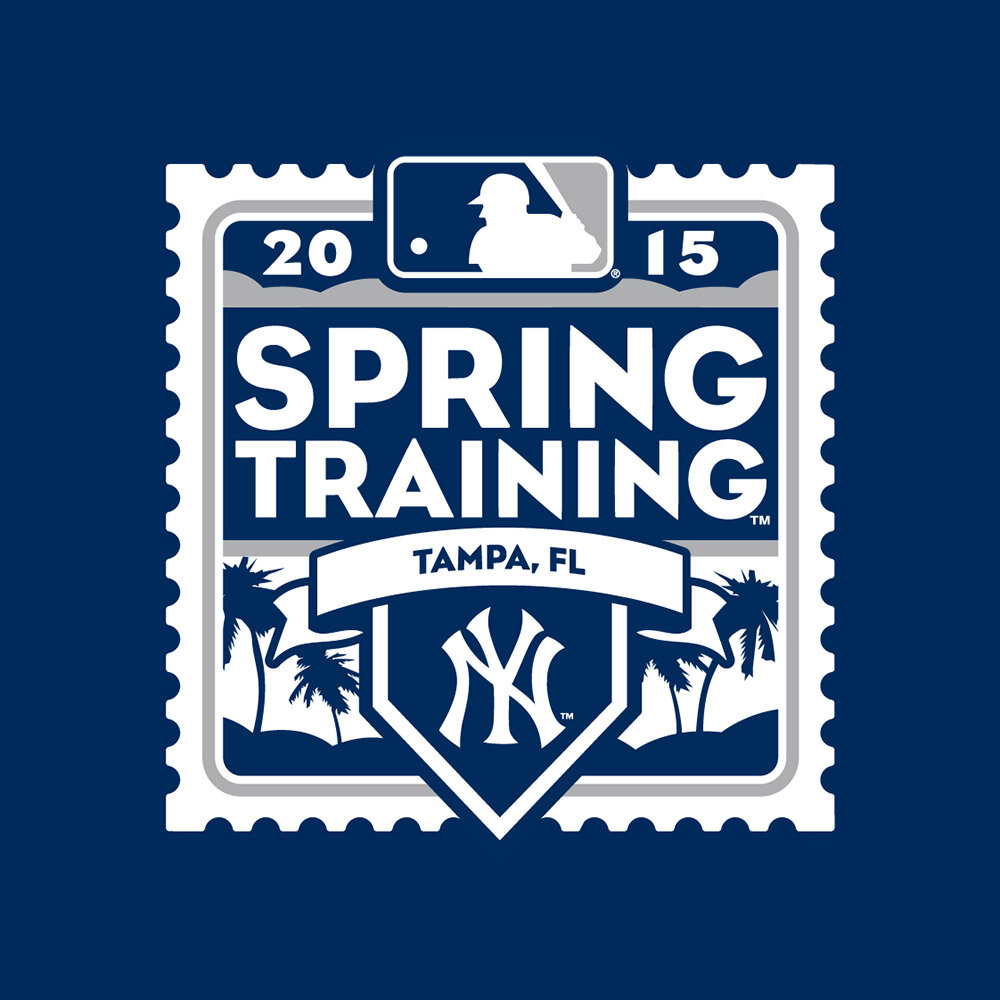
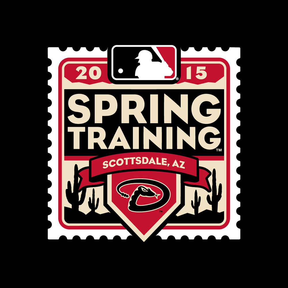
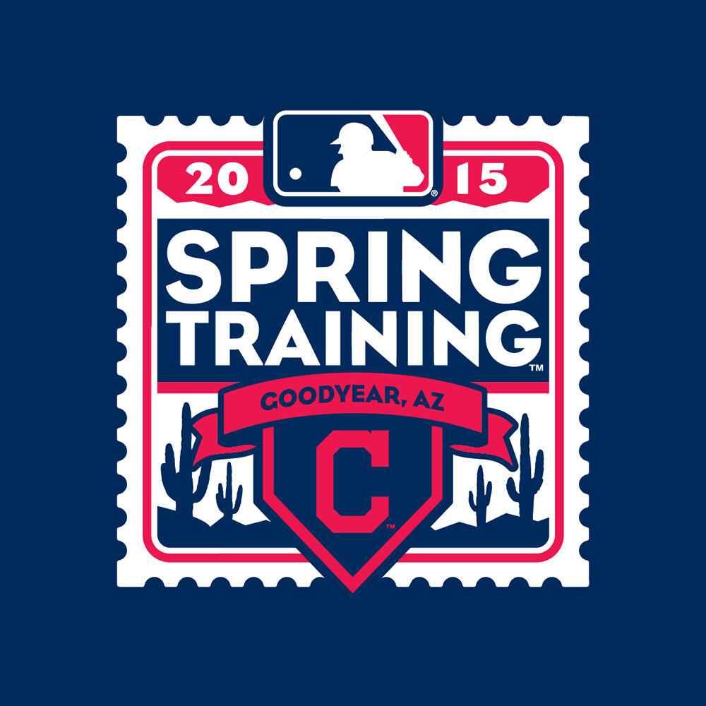
2015
Travel is an integral part to the Spring Training experience. In the past, we had explored concepts based on luggage tags, envelopes, and greeting cards to tie into this theme. For the 2014 program, we took the idea of “mailing a package” and turned that into the identity by creating a stamp. It evokes a postal theme of travel and journeying to your destination, and gets to show off a bit of the climate with a warm color palette and cactus and palm references. This was also the first year we featured uniquely colored versions of the marks for each of the 30 Clubs.


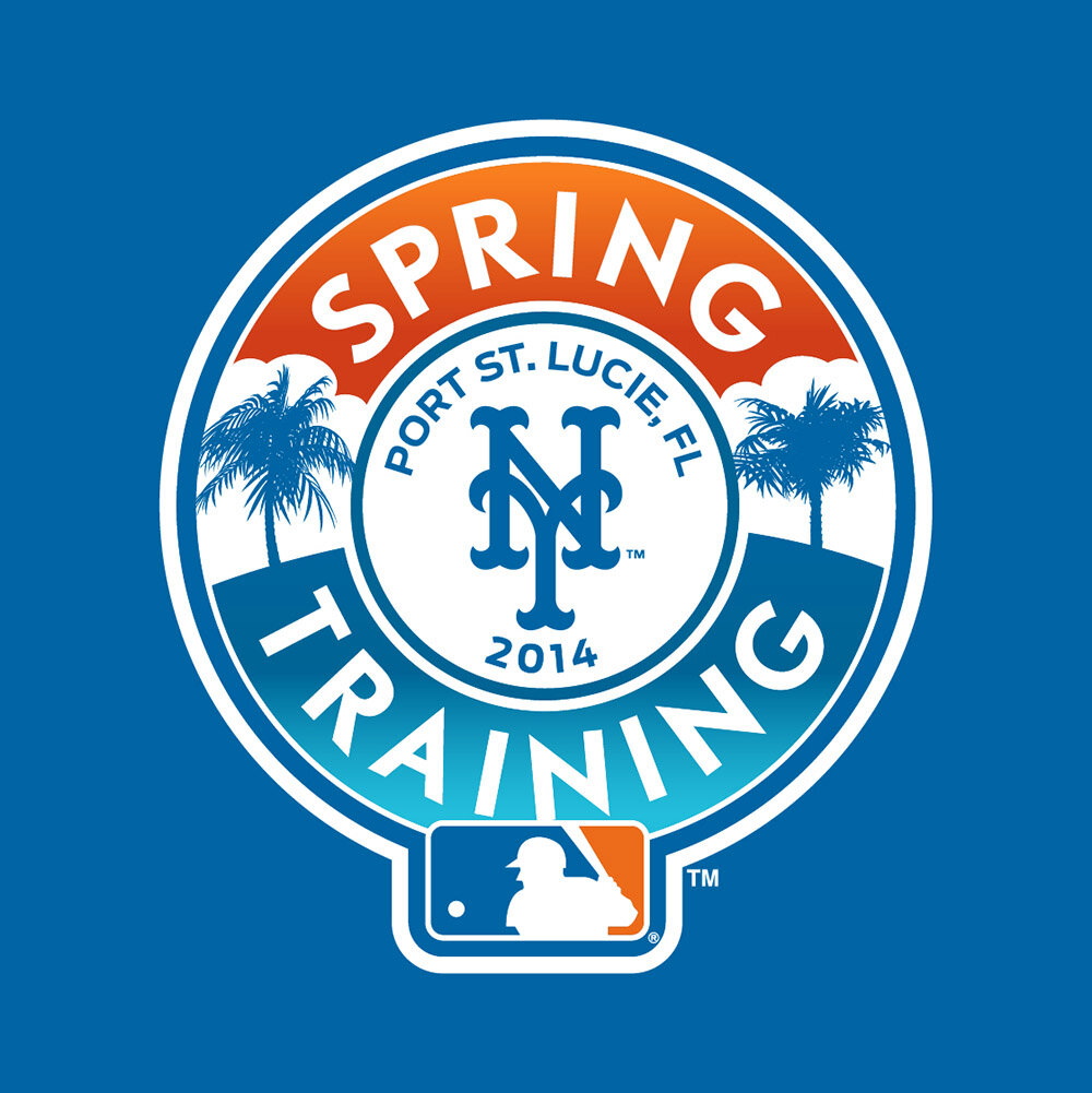
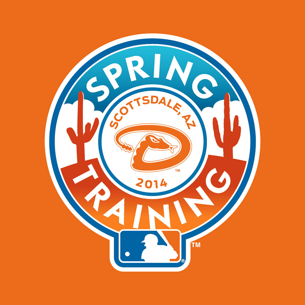
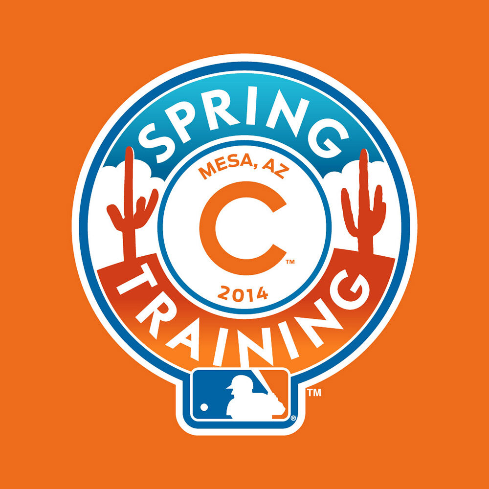
2014
The 2014 Spring Training identity was built around a simple and adaptable ring structure that holds each Club’s headwear mark and stadium location, along with either palm trees or cacti depending on the area. The color palette references the clear blue skies of spring and an orange hue that is a double reference to sand and the rich clay-colored dirt of a ball-field.