ARE TEAM BRAND COLORS SHIFTING?
The human eye is truly amazing in that it can distinguish up to a million different colors. And, from the perspective of sports branding, fans prove to be able to detect more than most as a result of their powerful emotional connections forged with their teams and their team colors. Even a slight shift in a legacy team color is noticed by astute fans who immediately call foul. That said, I wanted to share a color issue that we have seen popping up across the leagues related to shifting brand colors from medium to medium.
Consuming our sports brands on screens
As creatives that manage brands and brand style guides used to replicate those brands faithfully, we are dependent on technology. Recently, we have been wrestling with a color challenge that comes with the growing emphasis of digital applications (RGB) and shift away from the classic licensing manufacturing processes (matched screen-printed inks, match-color lithography, and embroidery threads) to dye sublimation technology (CMYK) and other processes such as Chromaflex that image team colors on everything from uniforms to licensed hard and soft lines. We are all witnessing a shift away from ink color matches to CMYK and RGB translations of swatch colors
Our industry relies on two companies that enable us to image sports brands: Pantone and Adobe.
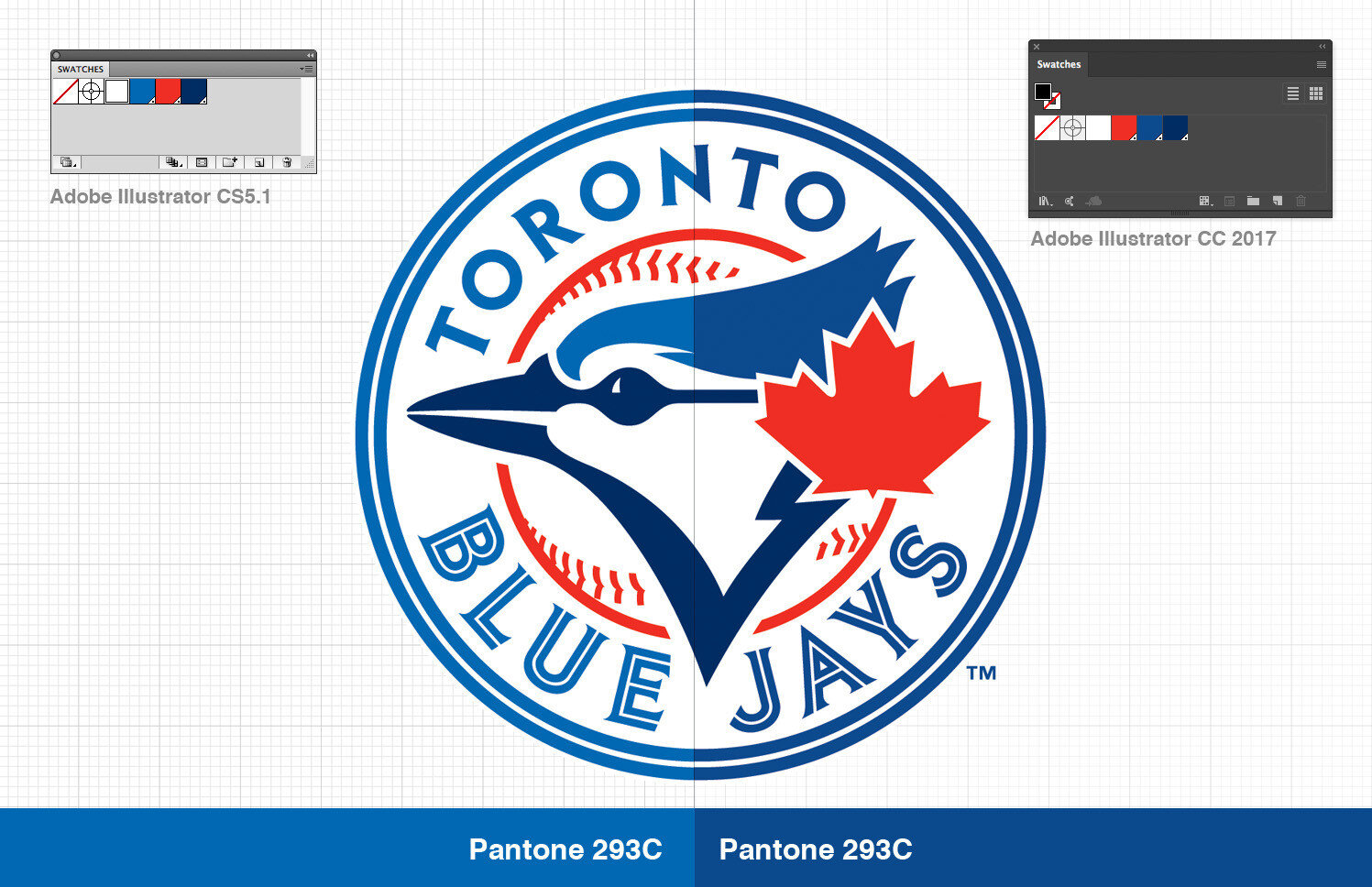
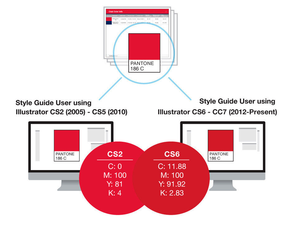
Pantone is our industry's color standard and Adobe Illustrator and Photoshop are the graphic software of choice. These two companies come together by way of Adobe's licensed use of the Pantone color standards. As a result, Pantone supplies the CMYK and RGB color simulations of swatch colors which are then baked into Adobe Illustrator files. This is where this color shifting issue comes into play. Pantone has made a major update to swatch color CMYK and RGB color simulations to what they feel is a 'more accurate representation of swatch colors'. Meanwhile, Adobe has released a new Illustrator program version that adopts these new formulations. The practical result is that if one creates a document in Adobe Illustrator CS5 and specifies Pantone 185–and then does the same in Adobe Creative Cloud (AKA Illustrator CS6 and forward), the result is significant visual color differences when rendered in RGB (on a screen) or CMYK (on digital output). The problem is that designers are not all using the same Illustrator version, and therefor, not using the same color formulations.
For a simple example of how this issue shows up on a day-to-day basis, we have chosen the Toronto Blue Jays and the Cincinnati Reds to demonstrate the issue.
In the case of the Blue Jays, Pantone's updated formulation for the lighter blue Pantone 293 is very dramatic. Some deeper saturated colors such as the Blue Jays' navy Pantone 282 have shown to be less of a shift.
In the case of the Reds, their signature red color renders very noticeably deeper than the legacy Pantone 200 formulation.
This wouldn't be worth a mention if all of a team's graphics where coming out of one central studio who could ensure continuity. But sports brands are replicated by a wide variety of stakeholders such as the print media, broadcast partners, creative agencies, digital media, soft good licensees, hard good licensees, digital licensees, web designers, print designers, environmental graphics designers…and the list goes on. And each of these stakeholder's will likely be using different versions of Adobe Illustrator, and will be for some time. And there is the rub.
Our aha moment
We were working on a team rebrand and had reached a point late in the process where illustrator files were being passed back and forth to the club's senior creative via email. They began noticing the colors shifting from file to file. We looked at the colors on all of our studio monitors and triple checked the use of the correct Pantone. We then traded printouts and the colors were clearly shifting between two distinct shades. We were able to trace the problem to files that we were sharing back and forth and were being updated on different versions of Illustrator. But we all wasted a lot of time and became frustrated prior to figuring out this Illustrator/Pantone issue.
*Note the huge jump in the cyan from zero to 11.88% while the black is halved.
The Bandaid Solution
A temporary solution that we have employed for legacy sports brands is “locking-in” the older Illustrator CS5 CMYK and RGB formulations that the brand owners have grown accustomed to. Basically, we create a custom color chip in CS5 based on the Pantone color by renaming it. But the preservation of aging-out Pantone's color simulation formulas will continue to wreak havoc when creating new brands. At what point do we adopt the new formulations? How long do we keep a version of Adobe Illustrator CS5 so we can specify legacy CMYK and RGB formulas? This is all further complicated by the staggered migration by designers to the current subscription-based Adobe Creative Cloud software that uses the new formulas.
So, for now, when a colleague, client, or QC department tells you that you got the color wrong, the answer just might be that everyone is using the correct color–just not the same formulas.
**STATEMENT FROM PANTONE
"Beginning with Adobe CS6, the PANTONE PLUS SERIES libraries are stored in L*a*b* color space. L*a*b* is the base color space used in color-management workflow, and should provide far more accurate onscreen simulation, as well as consistency in output using a color-managed workflow.
Prior to CS6, the PANTONE spot color libraries were stored in CMYK color space, which tended to make the onscreen display of colors quite muted and lifeless.
Wherever possible, you should consider updating your legacy files with swatches taken from the updated PANTONE PLUS SERIES colors, for most accurate color reproduction".


