THE EMERGING ROLE OF CUSTOM TYPOGRAPHY IN EVENT BRANDING

Major sporting events have grown through the years from solitary games to weeklong experiences–championship series can extend over a month. The All-Star game is now All-Star Week. The Super Bowl is the greatest show on earth, but it’s the NFL Experience that draws upward of a million visitors. As these events cross boundaries from a day to a week, from physical to virtual, from static to animated, they require branding elements that help one event flow seamlessly into another.
A custom font set has become one of the most powerful new tools in the branding arsenal. It enables branding opportunities in situations that logos simply cannot satisfy. It helps to amplify and strengthen the brand in unexpected new ways. Below are three examples of integrated custom fonts in action.
2017 Postseason Branding
For the 2017 Postseason, custom typography has created brand cohesion for a complex logo system that started with the the MLB playoffs and continued through the Division Series Championships, League Championships and, finally, the World Series.
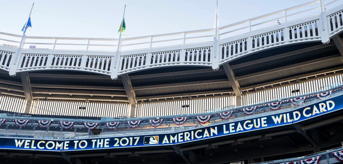

The defining aspect of the custom typography–developed with MLB Design Services–was the distinctive gold edges on each custom letterform that infused a signature quality throughout the branding system.
Each letterform has an alternate position of the gold edging to provide flexibility. (see the "D" and "S" variations in the Division Series logos vs. World Series logos).

In addition to anchoring the multi-tiered logo system, the ability to expand beyond the fixed logos and produce “branded messaging” without the necessity to dominate every communication with a primary logo provides new ways to amplify the branding. The font is instantly recognized as the branded voice of the event.


The ultimate job of the Postseason font is to move beyond "a logo" when establishing branding continuity across the myriad applications including on-field graphics, electronic stadium messaging, on-uniform, environmental in-stadium graphics, printed programs, tickets, embroidery, licensing, advertising, broadcast, and digital.
Summer Olympics: Rio 2016 Custom Font

While the full impact of the Rio 2016 Olympic Games branding and custom font is a bit diminished if watched exclusively over broadcast, the custom font created by Dalton-Maag was a triumph of branding at the 32 Olympic venues, at the Olympic village, and around the host city.


An excerpt from the official Olympic website boasted: "Each letter expresses a characteristic of the Rio 2016™ Games, its people and the city. The letters are written in single continuous strokes, with fast and fluid motions, suggesting the movements of the athletes in action. The strong contrast between thick and thin strokes was explored during the design process by putting brush to paper and writing by hand. The variety of the curves in the different letters has a unique informality, inspired by the joyfulness of the Brazilian people. It’s playful and buoyant personality was a perfect reflection of the Brazilian people. Welcoming, fun and vibrant.”


The Rio 2016 custom font skillfully provided a spirited connection between the 34 venues in over 100 languages.

Super Bowl XLVIII Custom Font
NFL’s past position that “A sports event of this stature needed a consistent, iconic identity — a symbol that fans could immediately recognize, much like the Olympic rings” has had many detractors, but has ironically highlighted the need for a custom font to tie together a mind-boggling list of related events that draw football fans from afar to experience the excitement around this grandest of American sporting events.

The Radio City neon-light inspired metallic gold font designed by Simi Mahtani provided the branding glue that the primary logo could not. With Super Bowl XLVIII right in our backyard, we got to see lots of activation.


Custom Typography For Event Brands
The best marquee event require a full range of brand assets that include the logo architecture, color palettes, theme art and patterns, but the growing demand of communications platforms and business partnerships requires the ability to not only express the brand–but to create branded messaging.
Where the logo system represents the brand, the custom font becomes a branded voice.
Tips
Fanbrandz has created jewel event branding programs and style guides for over two decades including over 50 custom fonts. Below is a "bare-essential" checklist we would like to share when creating custom typography as a core element of an event branding program:
1. The font should be created by an experienced type designer and delivered as an own-able, proprietary piece of intellectual property and delivered in the form of a true type font so it can be easily uploaded by internal designers and external partners. It should be shared and protected like the rest of the brand IP.
2. A well-crafted font should anticipate 'real-life' applications including a version for white backgrounds–and an alternate version for dark backgrounds.
3. Don’t forget the number set and special characters–especially those that are essential for social media handles and hashtags such as @fanbrandz and #fanbrandz.