COMMEMORATING TEN YEARS OF NHL’S WINTER CLASSIC GAMES
When the Sabres face off with the Rangers in this January’s Winter Classic, they will be commemorating the 10th anniversary of NHL’s incredible outdoor game series that celebrates the roots of hockey heritage.
We were again thrilled to work with NHL’s VP Creative, Paul Conway, to develop the identity for this event that faced an interesting combination of challenges that made for a unique solution.
The first consideration was the venue. Citi Field–located in Queens, NYC–was the host venue while it will technically be a Sabres home game, so we needed to strike the right balance.
Secondly, celebrating the 10th anniversary of this extremely popular event would need to be given an appropriate level of recognition and be integral to the branding system. The duel challenge was to honor two team cities and a 10th anniversary in a single mark and extended branding program.
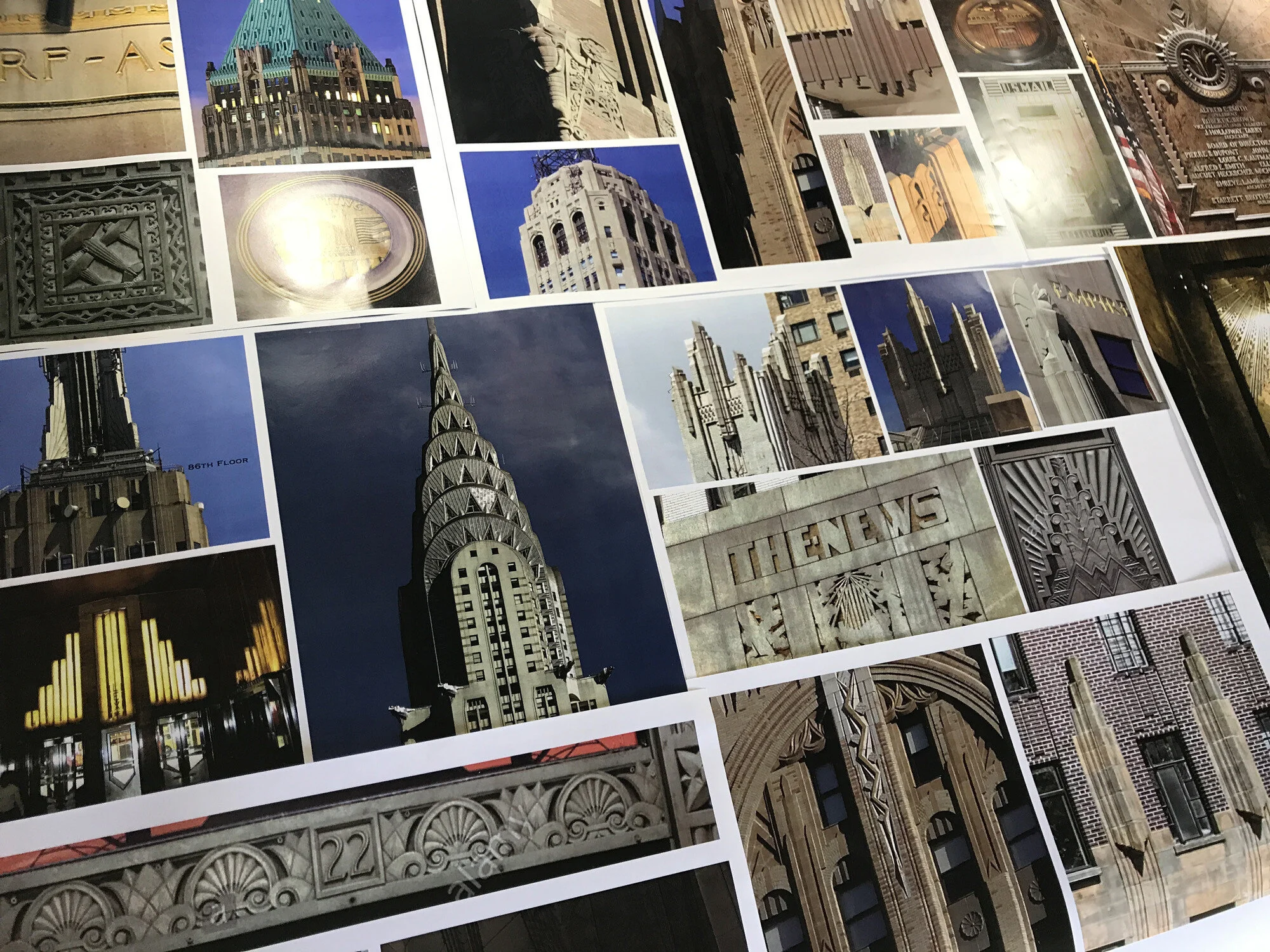
While many approaches were explored, through research, we discovered that in the early years of hockey, both Buffalo, New York and New York City simultaneously built important iconic buildings in the Art Deco architectural style. Buffalo built City Hall, Central Terminal, the Rand Building and many more distinguished examples, while in New York, we saw dozens of buildings including the Empire State Building, Wall Street and the Chrysler Building appear on the cityscape.
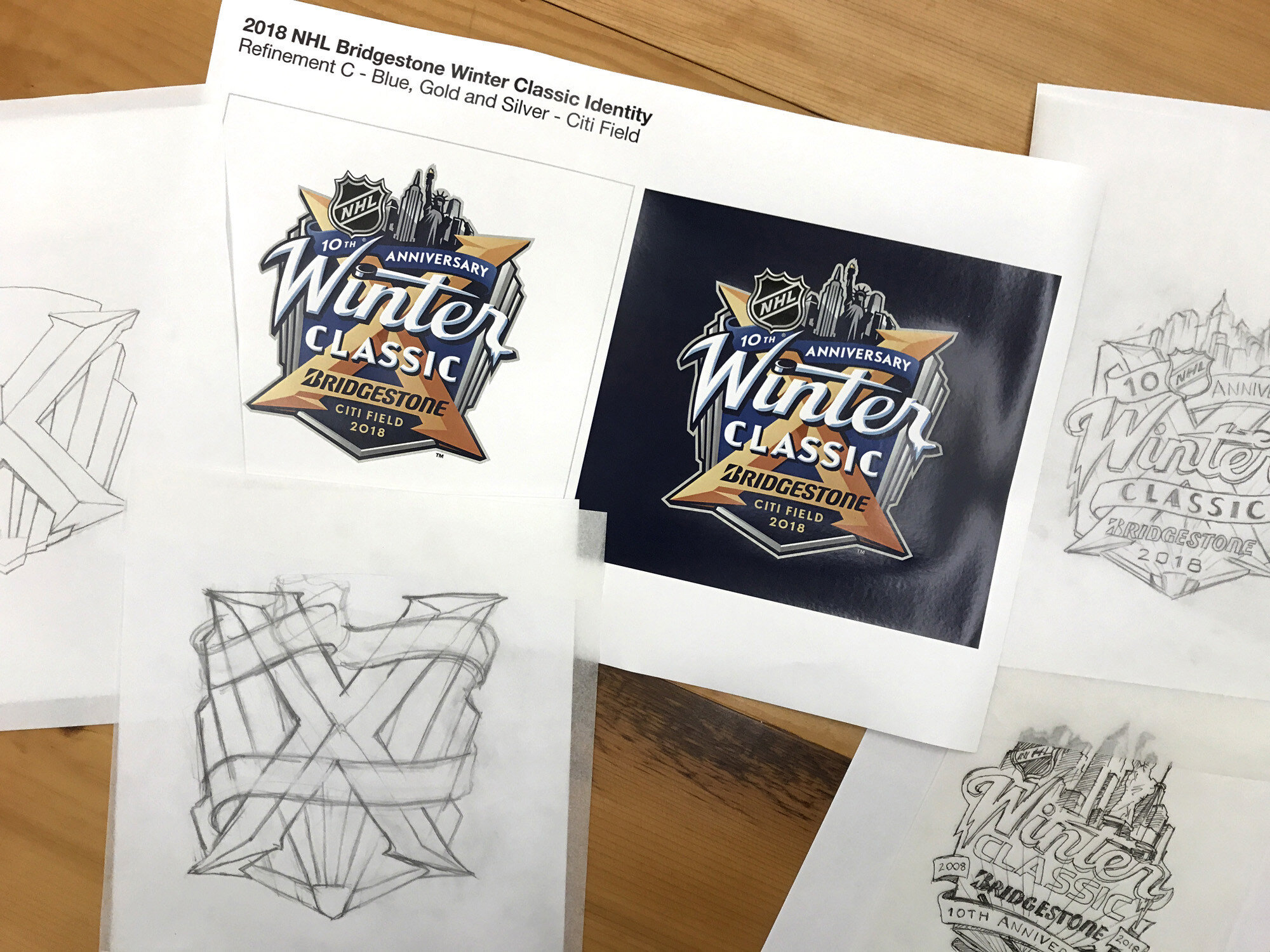
Establishing a link between the two cities through a shared architecture style at the same point in NHL's history allowed us to build a program that draws from Art Deco's rich vernacular of polished metals, vertical geometric forms and familiar motifs such as the scalloped frame, to present images of the Empire State as well as represent the roman “X” as an integrated beveled metallic object in the same Deco style.
Through much thumbnail sketching and proportioning of elements, we finally arrived at the optimum balance of components that we felt was successful.
The colors were influenced by New York State’s seal and flag. The secondary typography was influenced by art deco styles and contrast the evolving “Winter” script that has been a permanent part of each Winter Classic identity since the inaugural game in Buffalo on January 1, 2008.
Thanks again to the NHL and Paul Conway for their invaluable leadership and collaboration.


